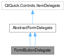
FormButtonDelegate

Properties | |
| string | description |
| alias | descriptionItem |
| var | leading |
| real | leadingPadding |
Detailed Description
A Form delegate that corresponds to a clickable button.
Use the inherited QtQuick.Controls.AbstractButton.text property to define the main text of the button.
The trailing property (right-most side of the button) includes an arrow pointing to the right by default and cannot be overridden.
- Since
- KirigamiAddons 0.11.0
Definition at line 22 of file FormButtonDelegate.qml.
Property Documentation
◆ description
|
read |
A label containing secondary text that appears under the inherited text property.
This provides additional information shown in a faint gray color.
This is supposed to be a short text and the API user should avoid making it longer than two lines.
Definition at line 33 of file FormButtonDelegate.qml.
◆ descriptionItem
|
read |
This property allows to override the internal description item (a QtQuick.Controls.Label) with a custom component.
Definition at line 38 of file FormButtonDelegate.qml.
◆ leading
|
read |
This property holds an item that will be displayed to the left of the delegate's contents.
default: null
Definition at line 45 of file FormButtonDelegate.qml.
◆ leadingPadding
|
read |
This property holds the padding after the leading item.
It is recommended to use Kirigami.Units here instead of direct values.
- See also
- Kirigami.Units
Definition at line 53 of file FormButtonDelegate.qml.
The documentation for this class was generated from the following file:
Documentation copyright © 1996-2024 The KDE developers.
Generated on Sat Apr 27 2024 22:09:57 by doxygen 1.10.0 written by Dimitri van Heesch, © 1997-2006
KDE's Doxygen guidelines are available online.