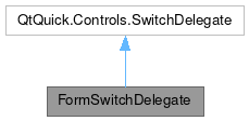
FormSwitchDelegate

Properties | |
| string | description |
| var | leading |
| real | leadingPadding |
| var | trailing |
| real | trailingPadding |
Detailed Description
A Form delegate that corresponds to a switch.
This component is used to create a purely on/off toggle for a single setting.
Use the inherited QtQuick.Controls.AbstractButton.text property to define the main text of the button.
If you need an on/off/tristate toggle, use a FormCheckDelegate instead.
If you need multiple values for the same setting, use a FormComboBoxDelegate instead.
If you need multiple toggles for the same setting, use a FormRadioDelegate instead.
- Since
- KirigamiAddons 0.11.0
- See also
- QtQuick.Controls.AbstractButton
- FormCheckDelegate
- FormComboBoxDelegate
- FormRadioDelegate
Definition at line 36 of file FormSwitchDelegate.qml.
Property Documentation
◆ description
|
read |
A label containing secondary text that appears under the inherited text property.
This provides additional information shown in a faint gray color.
Definition at line 43 of file FormSwitchDelegate.qml.
◆ leading
|
read |
This property holds an item that will be displayed to the left of the delegate's contents.
Definition at line 48 of file FormSwitchDelegate.qml.
◆ leadingPadding
|
read |
This property holds the padding after the leading item.
Definition at line 52 of file FormSwitchDelegate.qml.
◆ trailing
|
read |
This property holds an item that will be displayed to the right of the delegate's contents.
Definition at line 57 of file FormSwitchDelegate.qml.
◆ trailingPadding
|
read |
This property holds the padding before the trailing item.
Definition at line 61 of file FormSwitchDelegate.qml.
The documentation for this class was generated from the following file:
Documentation copyright © 1996-2025 The KDE developers.
Generated on Fri May 2 2025 11:56:59 by doxygen 1.13.2 written by Dimitri van Heesch, © 1997-2006
KDE's Doxygen guidelines are available online.