Onboarding Tutorial
Demonstrates how onboarding overlays can highlight controls on demand.
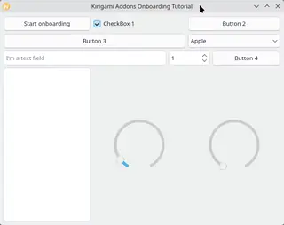
The example opens a Kirigami window and marks target controls with Onboarding attached properties. The overlay draws a highlight around the current focus area, and the tooltip text is driven by the current target's attached Onboarding::texts property.
Workflow
- Mark a source item with Onboarding::isSource.
- Add grouped Onboarding attached properties directly to controls inside Page1.qml, Page2.qml, and Page3.qml.
- Use Onboarding::start() or Onboarding::start(string) to begin walking the target items in a group.
- Use Onboarding::aboutToShow handlers to keep the swipe view synchronized with tutorial progression.
- Supply Onboarding::additionalDataComponent so the tooltip can show context-sensitive media from each step's Onboarding::additionalData.
Key Snippets
Start the default onboarding flow from a keyboard shortcut:
Shortcut {
    context: Qt.ApplicationShortcut
    sequence: "F1"

    onActivated: Onboarding.start()
}
Add attached properties with media content displayed in the tooltip:
Onboarding.texts: [qsTr("This button starts the default onboarding tutorial.")]
Onboarding.additionalData: ({
    video: "qrc:/qt/qml/org/kde/kirigamiaddons/examples/onboardingtutorial/onboarding-video.webp",
    videoCaption: "This is a video caption",
})
Run a per-step callback before focusing an item:
Onboarding.groups: ["advanced"]
Onboarding.texts: [qsTr("This checkbox is on the second page of the advanced flow.")]
Onboarding.onAboutToShow: item.swipeView.currentIndex = 1
Bind Onboarding::additionalDataComponent to dynamic media from the current item:
ColumnLayout {
    readonly property var additionalData: Onboarding.currentItem?.additionalData ?? ({})

    Platform.Theme.colorSet: Platform.Theme.Tooltip
    Platform.Theme.inherit: false

    implicitWidth: Math.max(video.Layout.preferredWidth, videoCaption.implicitWidth)
    spacing: 0
    visible: video.source.toString().length > 0

    AnimatedImage {
        id: video

        Layout.alignment: Qt.AlignHCenter
        Layout.maximumHeight: Kirigami.Units.gridUnit * 7
        Layout.maximumWidth: Kirigami.Units.gridUnit * 14
        Layout.preferredHeight: implicitWidth > 0 ? Math.min(Layout.preferredWidth * implicitHeight / implicitWidth, Layout.maximumHeight) : 0
        Layout.preferredWidth: implicitHeight > 0 && implicitWidth > 0 ? Math.min(implicitWidth, Layout.maximumWidth, Layout.maximumHeight * implicitWidth / implicitHeight) : 0
        fillMode: Image.PreserveAspectFit
        sourceSize.width: Layout.maximumWidth
        source: parent.additionalData.video ?? ""
    }

    QQC2.Label {
        id: videoCaption

        Layout.alignment: Qt.AlignHCenter
        Layout.preferredWidth: Math.min(implicitWidth, video.Layout.preferredWidth)
        color: Platform.Theme.textColor
        horizontalAlignment: Text.AlignHCenter
        text: parent.additionalData.videoCaption ?? ""
        visible: text.length > 0
        wrapMode: Text.WordWrap
    }
}
Keep the tutorial pages instantiated so targets remain available during onboarding:
Item {
    id: pageHost

    anchors.fill: parent
    Onboarding.isSource: true
    Onboarding.sourceGroups: ["", "advanced"]

    ColumnLayout {
        anchors.fill: parent
        spacing: 0

        QQC2.SwipeView {
            id: swipeView

            Layout.fillHeight: true
            Layout.fillWidth: true
            interactive: !Onboarding.active

            Page1 {
                swipeView: swipeView
            }

            Page2 {
                swipeView: swipeView
            }

            Page3 {
                swipeView: swipeView
            }
        }

        QQC2.PageIndicator {
            Layout.alignment: Qt.AlignHCenter
            Layout.bottomMargin: Kirigami.Units.largeSpacing
            count: swipeView.count
            currentIndex: swipeView.currentIndex
        }
    }
}
Summary
This example shows how to:
- Combine attached onboarding metadata with standard Qt Quick controls to drive an onboarding flow.
- Define default and named walkthrough groups over the same source.
- Highlight controls while blurring the surrounding source area.
- Synchronize dynamically visible pages before target lookup.
- Extend the visible tooltip content with Onboarding::additionalDataComponent.
Files:
- OnboardingTutorial/CMakeLists.txt
- OnboardingTutorial/Main.qml
- OnboardingTutorial/Page1.qml
- OnboardingTutorial/Page2.qml
- OnboardingTutorial/Page3.qml
- OnboardingTutorial/main.cpp
Images: