BottomDrawer QML Type
A bottom drawer component with a drag indicator. More...
| Import Statement: | import org.kde.kirigamiaddons.components |
| Inherits: |
Properties
- drawerContentItem : Item
- headerContentItem : Item
Detailed Description
Example:
import org.kde.kirigamiaddons.delegates as Delegates
import org.kde.kirigamiaddons.components as Components

Components.BottomDrawer {
    id: drawer

    headerContentItem: Kirigami.Heading {
        text: "Drawer"
    }

    Delegates.RoundedItemDelegate {
        text: "Action 1"
        icon.name: "list-add"
        onClicked: {
            doSomething()
            drawer.close()
        }
    }

    Delegates.RoundedItemDelegate {
        text: "Action 1"
        icon.name: "list-add"
        onClicked: {
            doSomething()
            drawer.close()
        }
    }
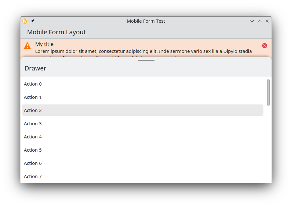
}
Property Documentation
drawerContentItem : Item [default]
This property holds the content item of the drawer.
headerContentItem : Item
This property holds the content item of the drawer header.
When no headerContentItem is set, the header will not be displayed.