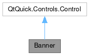
Banner

Properties | |
| listKirigamiAction | actions |
| alias | hoveredLink |
| bool | showCloseButton |
| string | text |
| string | title |
| int | type |
Signals | |
| void | linkActivated (string link) |
| void | linkHovered (string link) |
Detailed Description
An banner Item with support for informational, positive, warning and error types, and with support for associated actions.
Banner can be used to inform or interact with the user without requiring the use of a dialog and are positionned in the footer or header of a page. For inline content, see org::kde::kirigami::InlineMessage.
The Banner is hidden by default.
Optionally, actions can be added which are shown alongside an optional close button on the right side of the Item. If more actions are set than can fit, an overflow menu is provided.
Example usage:
- Since
- KirigamiAddons 0.10.0
Definition at line 50 of file Banner.qml.
Property Documentation
◆ actions
|
read |
This property holds the list of Kirigami Actions to show in the banner's internal kirigami::ActionToolBar.
Actions are added from left to right. If more actions are set than can fit, an overflow menu is provided.
Definition at line 102 of file Banner.qml.
◆ hoveredLink
|
read |
This property holds the link embedded in the message text that the user is hovering over.
- Remarks
- This property is read-only
Definition at line 66 of file Banner.qml.
◆ showCloseButton
|
read |
This property holds whether the close button is displayed.
default: false
Definition at line 94 of file Banner.qml.
◆ text
|
read |
This property holds the message text.
Definition at line 88 of file Banner.qml.
◆ title
|
read |
This property holds the message title.
Definition at line 84 of file Banner.qml.
◆ type
|
read |
This property holds the message type.
The following values are allowed:
Kirigami.MessageType.InformationKirigami.MessageType.PositiveKirigami.MessageType.WarningKirigami.MessageType.Error
default: Kirigami.MessageType.Information
Definition at line 80 of file Banner.qml.
Member Function Documentation
◆ linkActivated
|
signal |
This signal is emitted when a link is clicked or tapped in the message text.
- Parameters
-
The clicked or tapped link.
◆ linkHovered
|
signal |
This signal is emitted when a link is hovered in the message text.
- Parameters
-
The hovered link.
The documentation for this class was generated from the following file:
Documentation copyright © 1996-2024 The KDE developers.
Generated on Sat Apr 27 2024 22:09:57 by doxygen 1.10.0 written by Dimitri van Heesch, © 1997-2006
KDE's Doxygen guidelines are available online.