PlasmaComponents

Signals | |
| void | accepted () |
| void | clickedOutside () |
| void | rejected () |
Public Member Functions | |
| void | accept () |
| void | close () |
| void | open () |
| void | reject () |
Properties | |
| list< Item > | buttons |
| list< Item > | content |
| alias | privateButtonsHeight |
| alias | privateTitleHeight |
| int | status |
| list< Item > | title |
| Item | visualParent |
Detailed Description
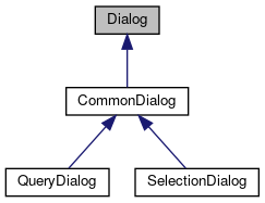
Top-level window for short-term tasks and brief interaction with the user.
- Since
- 0.1A dialog floats on the top layer of the application view, usually overlapping the area reserved for the application content. Normally, a dialog provides information and gives warnings to the user, or asks the user to answer a question or select an option.
Definition at line 53 of file Dialog.qml.
Member Function Documentation
| void Dialog::accept | ( | ) |
Accepts the dialog's request without any user interaction.
The method emits the accepted() signal and closes the internalLoader.dialog.
- See also
- reject()
|
signal |
This signal is emitted when the user accepts the dialog's request or the accept() method is called.
- See also
- rejected()
|
signal |
This signal is emitted when the user taps in the area that is inside the dialog's visual parent area but outside the dialog's area.
Normally the visual parent is the root object. In that case this signal is emitted if the user taps anywhere outside the dialog's area.
- See also
- visualParent
| void Dialog::close | ( | ) |
Closes the dialog without any user interaction.
| void Dialog::open | ( | ) |
Shows the dialog to the user.
| void Dialog::reject | ( | ) |
Rejects the dialog's request without any user interaction.
The method emits the rejected() signal and closes the internalLoader.dialog.
- See also
- accept()
|
signal |
This signal is emitted when the user rejects the dialog's request or the reject() method is called.
- See also
- accepted()
Property Documentation
| list<Item> Dialog::buttons |
A list of items in the dialog's button area.
For example, you can use Row or Button components but you can also use any number of components that are based on Item component.
Definition at line 72 of file Dialog.qml.
| list<Item> Dialog::content |
A list of items in the dialog's content area.
You can use any component that is based on Item. For example, you can use ListView, so that the user can select from a list of names.
Definition at line 66 of file Dialog.qml.
| alias Dialog::privateButtonsHeight |
Definition at line 92 of file Dialog.qml.
| alias Dialog::privateTitleHeight |
Definition at line 90 of file Dialog.qml.
| int Dialog::status |
Indicates the dialog's phase in its life cycle.
The values are as follows:
- DialogStatus.Opening - the dialog is opening
- DialogStatus.Open - the dialog is open and visible to the user
- DialogStatus.Closing - the dialog is closing
- DialogStatus.Closed - the dialog is closed and not visible to the user
The dialog's initial status is DialogStatus.Closed.
Definition at line 88 of file Dialog.qml.
| list<Item> Dialog::title |
A list of items in the dialog's title area.
You can use a Text component but also any number of components that are based on Item. For example, you can use Text and Image components.
Definition at line 60 of file Dialog.qml.
| Item Dialog::visualParent |
The item that the dialog refers to.
The dialog will usually be positioned relative to VisualParent
Definition at line 77 of file Dialog.qml.
The documentation for this class was generated from the following file:
Documentation copyright © 1996-2020 The KDE developers.
Generated on Mon Jun 22 2020 13:08:40 by doxygen 1.8.7 written by Dimitri van Heesch, © 1997-2006
KDE's Doxygen guidelines are available online.
 KDE API Reference