Chip QML Type
A compact element that represents an attribute, action, or filter. More...
| Import Statement: | import org.kde.kirigami |
| Inherits: |
Properties
- closable : bool
- iconMask : bool
- interactive : bool
Signals
- removed()
Detailed Description
Should be used in a group of multiple elements. e.g when displaying tags in a image viewer.
Example usage:
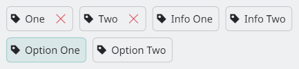
import QtQuick
import org.kde.kirigami as Kirigami

Flow {
    spacing: Kirigami.Units.largeSpacing

    ListModel {
        id: chipsModel
        ListElement { text: "One"; closable: true }
        ListElement { text: "Two"; closable: true }
        ListElement { text: "Info One"; closable: false; interactive: false }
        ListElement { text: "Info Two"; closable: false; interactive: false }
        ListElement { text: "Option One"; closable: false; interactive: true }
        ListElement { text: "Option Two"; closable: false; interactive: true }
    }

    Repeater {
        model: chipsModel

        Kirigami.Chip {
            required property var model

            text: model.text
            icon.name: "tag-symbolic"
            closable: model.closable
            interactive: model.interactive
            onClicked: {
                // ...
            }
            onRemoved: {
                // ...
            }
        }
    }
}
Property Documentation
closable : bool
This property holds whether or not to display a close button.
default: true
iconMask : bool
This property holds whether the icon should be masked or not. This controls the Kirigami.Icon.isMask property.
default: false
interactive : bool
This property holds whether the Chip should react to input or not. If set to false, click and hover events will be ignored.
default: true
Signal Documentation
removed()
This signal is emitted when the close button has been clicked.
Note: The corresponding handler is onRemoved.