ContextualHelpButton QML Type
An inline help button that shows a tooltip when clicked. More...
| Import Statement: | import org.kde.kirigami |
Properties
- toolTipText : string
- toolTipVisible : bool
Detailed Description
Use this component when you want to explain details or usage of a feature of the UI, but the explanation is too long to fit in an inline label, and too important to put in a hover tooltip and risk the user missing it.
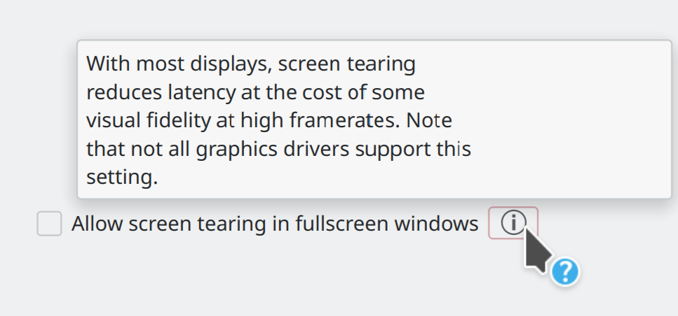
Example usage:
import QtQuick.Controls as QQC2
import QtQuick.Layouts
import org.kde.kirigami as Kirigami

RowLayout {
    spacing: Kirigami.Units.smallSpacing

    QQC2.CheckBox {
        text: i18n("Allow screen tearing in fullscreen windows")
    }

    Kirigami.ContextualHelpButton {
        toolTipText: i18n("With most displays, screen tearing reduces latency at the cost of some visual fidelity at high framerates. Note that not all graphics drivers support this setting.")
    }
}