FormDelegateCollapsible QML Type
A delegate designed to display or hide formcard contents. More...
| Import Statement: | import org.kde.kirigamiaddons.formcard |
| Inherits: |
Properties
- button : FormButtonDelegate
- description : alias
- expanded : bool
- itemAboveNext : Item
- itemBelowPrev : Item
- text : alias
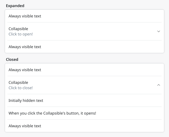
Detailed Description
import org.kde.kirigamiaddons.formcard as FormCard

FormCard.FormCard {
     FormCard.FormTextDelegate {
         text: "Always visible text"
     }
     FormCard.FormDelegateSeparator {
         below: collapsible.itemBelowPrev
     }
     FormDelegateCollapsible {
         id: collapsible
         text: "Collapsible"
         description: expanded ? "Click to close!" : "Click to open!"

         FormCard.FormTextDelegate {
             text: "Initially hidden text"
         }
         FormCard.FormDelegateSeparator {}
         FormCard.FormTextDelegate {
             text: "When you click the Collapsible's button, it opens!"
         }
     }
     FormCard.FormDelegateSeparator {
         above: collapsible.itemAboveNext
     }
     FormCard.FormTextDelegate {
         text: "Always visible text"
     }
 }
Property Documentation
button : FormButtonDelegate [read-only]
The buttonDelegate itself.
description : alias
The buttonDelegate's description.
expanded : bool
Controls if the button should be expanded.
itemAboveNext : Item [read-only]
The delegate visually above the delegate following the collapsible. When a FormDelegateSeparator is below this, bind its "above" property to this.
itemBelowPrev : Item [read-only]
The delegate visually below the previous delegate. When a FormDelegateSeparator is above this, bind its "below" property to this.
text : alias
The buttonDelegate's text.