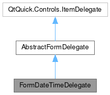
FormDateTimeDelegate

Public Types | |
| enum class | DateTimeDisplay { DateTime , Date , Time } |
Properties | |
| int | dateTimeDisplay |
| date | initialValue |
| date | maximumDate |
| date | minimumDate |
| var | popupParent |
| bool | readOnly |
| var | status |
| string | statusMessage |
| date | value |
Detailed Description
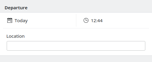
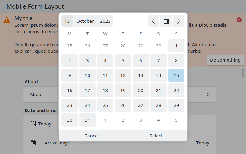
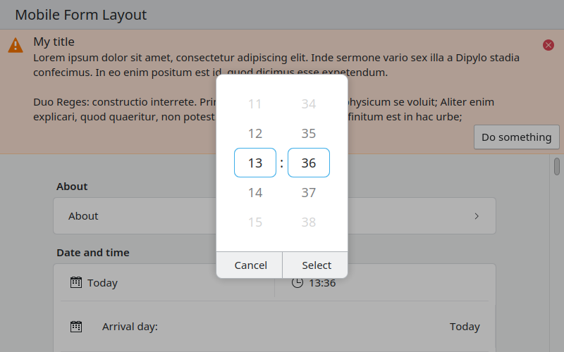
FormDateTimeDelegate is a delegate for FormCard that lets the user enters either a date, a time or both.
This component allow to define a minimumDate and maximumDate to restrict the date that the user is allowed to enters.
Ideally for this FormDelegate, it is better to not add a label but to instead makes it clear from the above FormHeader to that the form delegate refers too.


- Note
- This component can also be used in a read only mode to display a date.
- Warning
- This will use the native date and time picker from the platform if available. E.g. this happens on Android.
- Since
- KirigamiAddons 0.12.0
Definition at line 53 of file FormDateTimeDelegate.qml.
Member Enumeration Documentation
◆ DateTimeDisplay
|
strong |
Enum containing the different part of the date time that can be displayed.
| Enumerator | |
|---|---|
| DateTime | Show the date and time. |
| Date | Show only the date. |
| Time | Show only the time. |
Definition at line 58 of file FormDateTimeDelegate.qml.
Property Documentation
◆ dateTimeDisplay
|
read |
This property holds which part of the date and time selector are show to the user.
By default both the time and the date are shown.
Definition at line 69 of file FormDateTimeDelegate.qml.
◆ initialValue
|
read |
This property holds the the date to use as initial default when editing an an unset date.
By default, this is the current date/time.
Definition at line 88 of file FormDateTimeDelegate.qml.
◆ maximumDate
|
read |
This property holds the maximum date (inclusive) that the user can select.
By default, no limit is applied to the date selection.
Definition at line 81 of file FormDateTimeDelegate.qml.
◆ minimumDate
|
read |
This property holds the minimum date (inclusive) that the user can select.
By default, no limit is applied to the date selection.
Definition at line 75 of file FormDateTimeDelegate.qml.
◆ popupParent
|
read |
This property holds the parent used for the popups of this control.
Definition at line 130 of file FormDateTimeDelegate.qml.
◆ readOnly
|
read |
This property holds whether this delegate is readOnly or whether the user can select a new time and date.
Definition at line 93 of file FormDateTimeDelegate.qml.
◆ status
|
read |
This property holds the current status message type of the text field.
This consists of an inline message with a colorful background and an appropriate icon.
The status property will affect the color of statusMessage used.
Accepted values:
Kirigami.MessageType.Information(blue color)Kirigami.MessageType.Positive(green color)Kirigami.MessageType.Warning(orange color)Kirigami.MessageType.Error(red color)
default: Kirigami.MessageType.Information if statusMessage is set, nothing otherwise.
- See also
- Kirigami.MessageType
Definition at line 118 of file FormDateTimeDelegate.qml.
◆ statusMessage
|
read |
This property holds the current status message of the text field.
If this property is not set, no status will be shown.
Definition at line 125 of file FormDateTimeDelegate.qml.
◆ value
|
read |
The current date and time selected by the user.
Definition at line 97 of file FormDateTimeDelegate.qml.
The documentation for this class was generated from the following file:
Documentation copyright © 1996-2025 The KDE developers.
Generated on Fri May 2 2025 11:56:59 by doxygen 1.13.2 written by Dimitri van Heesch, © 1997-2006
KDE's Doxygen guidelines are available online.