IconItem
Properties | |
| int | alignment |
| color | color |
| alias | fillMode |
| bool | highlighted |
| bool | hovered |
| alias | icon |
| int | iconSizeHint |
| alias | iconSource |
| alias | image |
| int | imageHeight |
| int | imageSizeHint |
| alias | imageSource |
| int | imageWidth |
| alias | isMask |
| int | maskRadius |
Additional Inherited Members | |
 Public Member Functions inherited from QtQuick.Item Public Member Functions inherited from QtQuick.Item | |
| childAt (real x, real y) | |
| bool | contains (point point) |
| dumpItemTree () | |
| forceActiveFocus () | |
| forceActiveFocus (Qt::FocusReason reason) | |
| bool | grabToImage (callback, targetSize) |
| point | mapFromGlobal (real x, real y) |
| point | mapFromItem (Item item, point p) |
| point | mapFromItem (Item item, real x, real y) |
| rect | mapFromItem (Item item, real x, real y, real width, real height) |
| rect | mapFromItem (Item item, rect r) |
| point | mapToGlobal (real x, real y) |
| point | mapToItem (Item item, point p) |
| point | mapToItem (Item item, real x, real y) |
| rect | mapToItem (Item item, real x, real y, real width, real height) |
| rect | mapToItem (Item item, rect r) |
| nextItemInFocusChain (bool forward) | |
Detailed Description
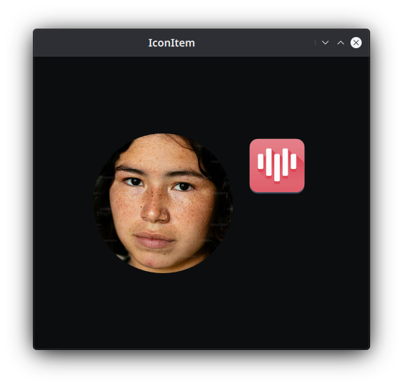
An element to display an icon from the icon theme or file asset; or an image from a local file or a remote URL.
- Since
- org.mauikit.controls 1.0
This controls inherits from QQC2 Item, to checkout its inherited properties refer to the Qt Docs.
- Note
- The image can be masked to have a rounded borders.
- See also
- maskRadius
Notes
By default this item is only visible if the image source is ready or if the icon is valid. You can make it always visible, but would be a better idea to set a fallback icon with icon.fallback: "icon-name".
You can find a more complete example at this link.
Definition at line 64 of file IconItem.qml.
Property Documentation
◆ alignment
|
read |
The aligment of the image in the container.
If the imageSizeHint has been set to a smaller size than the container, then its alignment will be dtermined by this property. Otherwise the image will fill the container size. By default this is set to Qt.AlignHCenter. Possible values are:
Definition at line 160 of file IconItem.qml.
◆ color
|
read |
The desired color for tinting the monochromatic icons.
By default this is set to check the isMask property, and then decide base on the highlighted property is use the text color or accent color.
Definition at line 150 of file IconItem.qml.
◆ fillMode
|
read |
The preferred fill mode for the image.
By default this is set to Image.PreserveAspectFit.
- Note
- For more options and information review the QQC2 Image documentation.
Definition at line 112 of file IconItem.qml.
◆ highlighted
|
read |
Whether the control should be styled as being highlighted by some external event.
By default this is set to false.
- Note
- When highlighted a monochromatic icon will take the color fo the accent color.
Definition at line 75 of file IconItem.qml.
◆ hovered
|
read |
Whether the control should be styled as being hovered by a cursor.
By default his is set to false.
Definition at line 80 of file IconItem.qml.
◆ icon
|
read |
An alias to the MauiKit Icon control for displaying the icon.
- Remarks
- This property is read-only
- See also
- Icon
Definition at line 145 of file IconItem.qml.
◆ iconSizeHint
|
read |
A hint for the size of the icon.
It will never be larger than the actual container size.
- Note
- If the container size is 200x200, and the icon size hint has been set to 64, then the icon will be centered. If the icon size hint is larger, then the maximum value will be the container size.
By default this is set to Style.iconSizes.big.
Definition at line 87 of file IconItem.qml.
◆ iconSource
|
read |
The name of the icon to be used.
Definition at line 105 of file IconItem.qml.
◆ image
|
read |
An alias to the QQC2 Image control for displaying the image.
- Remarks
- This property is read-only
- Note
- Review the control own properties on Qt documentation.
Definition at line 138 of file IconItem.qml.
◆ imageHeight
|
read |
The painted height size of the image.
This will make the image resolution fit this size. By default this is set to -1, which means that the image will be loaded with its original resolution size.
Definition at line 127 of file IconItem.qml.
◆ imageSizeHint
|
read |
A hint for the size of the image.
It will never be larger than the actual container size.
- Note
- If the container size is 200x200, and the image size hint has been set to 140, then the image will be aligned following the
alignmentproperty. If the image size hint is larger, then the maximum value will be the container size.
- See also
- alignment
By default this is set to -1, which means the image will fill the container size..
Definition at line 95 of file IconItem.qml.
◆ imageSource
|
read |
The local or remote file URL of the image to be used.
Definition at line 100 of file IconItem.qml.
◆ imageWidth
|
read |
The painted width size of the image.
This will make the image resolution fit this size. By default this is set to -1, which means that the image will be loaded with its original resolution size.
Definition at line 122 of file IconItem.qml.
◆ isMask
|
read |
Whether the icon should be masked and tinted with the text color, this is used for monochromatic icons.
If you plan to use a colorful icon, consider setting this property to false.
Definition at line 131 of file IconItem.qml.
◆ maskRadius
|
read |
The border radius to mask the icon/image header section.
By default this is set to 0.
Definition at line 117 of file IconItem.qml.
The documentation for this class was generated from the following file:
Documentation copyright © 1996-2024 The KDE developers.
Generated on Fri May 3 2024 11:47:05 by doxygen 1.10.0 written by Dimitri van Heesch, © 1997-2006
KDE's Doxygen guidelines are available online.