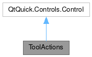
ToolActions

Properties | |
| list< Action > | actions |
| bool | autoExclusive |
| bool | canCyclic |
| bool | checkable |
| int | count |
| bool | cyclic |
| string | defaultIconName |
| int | display |
| bool | expanded |
| bool | flat |
Public Member Functions | |
| void | uncheck (except) |
Detailed Description
A set of grouped action visually joined together.
This control inherits from QQC2 Control, to checkout its inherited properties refer to the Qt Docs.
The set actions can be checkable and auto-exclusive or not.

Features
This control supports checkable and non-checkable actions. Also auto-exclusive and non-auto-exclusive actions.
When enabling the autoExclusive property, then only one action in the group can be marked as checked at the time.
There is also the option to collapse the actions into a single button with a popup menu where the actions are listed, this is useful when the available space changes and the control needs to be made more compact to save space.

If only two actions are added and marked as auto-exclusive, then this control has the option to enable a cyclic behavior, which means that toggling one button will activate the next action in line and cyclic around.
Heres a example of how to achieve such behavior:
You can find a more complete example at this link.
Definition at line 90 of file ToolActions.qml.
Property Documentation
◆ actions
|
read |
The list of QQC2 Action to be listed.
These can be declared a children elements of this control.
- Remarks
- This is the default property
Definition at line 104 of file ToolActions.qml.
◆ autoExclusive
|
read |
Whether this control should only allow one action to be checked at the time.
By default this is set to true
Definition at line 109 of file ToolActions.qml.
◆ canCyclic
|
read |
Whether the cyclic behavior can be activated.
For it to be possible, the conditions are: only two actions and those must be auto-exclusive.
- See also
- cyclic
- autoExclusive
- count
- Remarks
- This property is read-only
Definition at line 140 of file ToolActions.qml.
◆ checkable
|
read |
Whether the action button can be checked.
If enabled, then the state will be styled accordingly. @By default this is set to true.
Definition at line 114 of file ToolActions.qml.
◆ count
|
read |
The total amount of actions declared.
- Remarks
- This property is read-only
Definition at line 150 of file ToolActions.qml.
◆ cyclic
|
read |
Whether two actions can be triggered in a cyclic manner.
So one press will activate the next action and then cycle around to the first one again.
- Note
- For this to work only two actions can be added
- See also
- canCyclic By default this is set to
false
Definition at line 131 of file ToolActions.qml.
◆ defaultIconName
|
read |
The icon name to be used in the button that opens the menu popup, when the view is collapsed.
By default this is set to application-menu.
Definition at line 160 of file ToolActions.qml.
◆ display
|
read |
Options on how to display the button text and icon.
Available options are:
- ToolButton.IconOnly
- ToolButton.TextBesideIcon
- ToolButton.TextOnly
- ToolButton.TextUnderIcon By default this is set to
ToolButton.TextBesideIcon
Definition at line 124 of file ToolActions.qml.
◆ expanded
|
read |
Whether the control should display all the actions as buttons in a row, or to collapse them into a popup menu.
By default this is set to true.
Definition at line 155 of file ToolActions.qml.
◆ flat
|
read |
Whether the style of this control should be styled as flat.
By default this is set to false.
Definition at line 145 of file ToolActions.qml.
Member Function Documentation
◆ uncheck()
| void ToolActions::uncheck | ( | except | ) |
Forces to uncheck all the actions except the one action sent as the argument.
- Parameters
-
except the action that should not be unchecked.
The documentation for this class was generated from the following file:
Documentation copyright © 1996-2025 The KDE developers.
Generated on Fri May 2 2025 11:57:11 by doxygen 1.13.2 written by Dimitri van Heesch, © 1997-2006
KDE's Doxygen guidelines are available online.