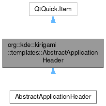
org::kde::kirigami::templates::AbstractApplicationHeader

Properties | |
| Item | background |
| int | bottomPadding |
| alias | contentItem |
| bool | hideWhenTouchScrolling |
| int | leftPadding |
| int | maximumHeight |
| int | minimumHeight |
| Item | page |
| Item | pageRow |
| int | paintedHeight |
| int | position |
| int | preferredHeight |
| int | rightPadding |
| bool | separatorVisible |
| int | topPadding |
Additional Inherited Members | |
 Public Member Functions inherited from QtQuick.Item Public Member Functions inherited from QtQuick.Item | |
| childAt (real x, real y) | |
| bool | contains (point point) |
| dumpItemTree () | |
| forceActiveFocus () | |
| forceActiveFocus (Qt::FocusReason reason) | |
| bool | grabToImage (callback, targetSize) |
| point | mapFromGlobal (real x, real y) |
| point | mapFromItem (Item item, point p) |
| point | mapFromItem (Item item, real x, real y) |
| rect | mapFromItem (Item item, real x, real y, real width, real height) |
| rect | mapFromItem (Item item, rect r) |
| point | mapToGlobal (real x, real y) |
| point | mapToItem (Item item, point p) |
| point | mapToItem (Item item, real x, real y) |
| rect | mapToItem (Item item, real x, real y, real width, real height) |
| rect | mapToItem (Item item, rect r) |
| nextItemInFocusChain (bool forward) | |
Detailed Description
An item that can be used as a title for the application.
Scrolling the main page will make it taller or shorter (through the point of going away) It's a behavior similar to the typical mobile web browser addressbar the minimum, preferred and maximum heights of the item can be controlled with
- minimumHeight: default is 0, i.e. hidden
- preferredHeight: default is Units.gridUnit * 1.6
- maximumHeight: default is Units.gridUnit * 3
To achieve a titlebar that stays completely fixed just set the 3 sizes as the same
Import Statement
- Version
- 2.2
Definition at line 27 of file controls/templates/AbstractApplicationHeader.qml.
Property Documentation
◆ background
|
read |
This property holds the background item.
- Note
- the background will be automatically sized to fill the whole control
Definition at line 75 of file controls/templates/AbstractApplicationHeader.qml.
◆ bottomPadding
|
read |
Definition at line 56 of file controls/templates/AbstractApplicationHeader.qml.
◆ contentItem
|
read |
- Remarks
- This is the default property
Definition at line 45 of file controls/templates/AbstractApplicationHeader.qml.
◆ hideWhenTouchScrolling
|
read |
This property specifies whether the header should be pushed back when scrolling using the touch screen.
Definition at line 63 of file controls/templates/AbstractApplicationHeader.qml.
◆ leftPadding
|
read |
Definition at line 50 of file controls/templates/AbstractApplicationHeader.qml.
◆ maximumHeight
|
read |
Definition at line 35 of file controls/templates/AbstractApplicationHeader.qml.
◆ minimumHeight
|
read |
Definition at line 31 of file controls/templates/AbstractApplicationHeader.qml.
◆ page
|
read |
Definition at line 42 of file controls/templates/AbstractApplicationHeader.qml.
◆ pageRow
|
read |
Definition at line 40 of file controls/templates/AbstractApplicationHeader.qml.
◆ paintedHeight
|
read |
- Remarks
- This property is read-only
Definition at line 48 of file controls/templates/AbstractApplicationHeader.qml.
◆ position
|
read |
Definition at line 37 of file controls/templates/AbstractApplicationHeader.qml.
◆ preferredHeight
|
read |
Definition at line 33 of file controls/templates/AbstractApplicationHeader.qml.
◆ rightPadding
|
read |
Definition at line 54 of file controls/templates/AbstractApplicationHeader.qml.
◆ separatorVisible
|
read |
Definition at line 58 of file controls/templates/AbstractApplicationHeader.qml.
◆ topPadding
|
read |
Definition at line 52 of file controls/templates/AbstractApplicationHeader.qml.
The documentation for this class was generated from the following file:
Documentation copyright © 1996-2025 The KDE developers.
Generated on Fri May 2 2025 12:02:16 by doxygen 1.13.2 written by Dimitri van Heesch, © 1997-2006
KDE's Doxygen guidelines are available online.