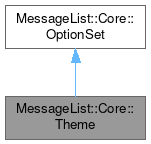
MessageList::Core::Theme
#include <theme.h>

Classes | |
| class | Column |
| class | ContentItem |
| class | Row |
Public Types | |
| enum | GroupHeaderBackgroundMode { Transparent , AutoColor , CustomColor } |
| enum | GroupHeaderBackgroundStyle { PlainRect , PlainJoinedRect , RoundedRect , RoundedJoinedRect , GradientRect , GradientJoinedRect , StyledRect , StyledJoinedRect } |
| enum | ThemeIcon { IconNew , IconUnread , IconRead , IconDeleted , IconReplied , IconRepliedAndForwarded , IconQueued , IconActionItem , IconSent , IconForwarded , IconImportant , IconWatched , IconIgnored , IconSpam , IconHam , IconFullySigned , IconPartiallySigned , IconUndefinedSigned , IconNotSigned , IconFullyEncrypted , IconPartiallyEncrypted , IconUndefinedEncrypted , IconNotEncrypted , IconAttachment , IconAnnotation , IconInvitation , IconShowMore , IconShowLess , IconVerticalLine , IconHorizontalSpacer , _IconCount } |
| enum | ViewHeaderPolicy { ShowHeaderAlways , NeverShowHeader } |
Static Public Member Functions | |
| static bool | compareName (Theme *theme1, Theme *theme2) |
| static QList< QPair< QString, int > > | enumerateGroupHeaderBackgroundStyles () |
| static QList< QPair< QString, int > > | enumerateViewHeaderPolicyOptions () |
Protected Member Functions | |
| void | clearPixmapCache () const |
| bool | load (QDataStream &stream) override |
| void | populatePixmapCache () const |
| void | save (QDataStream &stream) const override |
Additional Inherited Members | |
 Protected Attributes inherited from MessageList::Core::OptionSet Protected Attributes inherited from MessageList::Core::OptionSet | |
| QString | mDescription |
| QString | mId |
| QString | mName |
| bool | mReadOnly = false |
Detailed Description
The Theme class defines the visual appearance of the MessageList.
The core structure of the theme is made up of Column objects which are mapped to View (QTreeView) columns. Each theme must provide at least one column.
Each column contains a set of Row objects dedicated to message items and a set of Row objects dedicated to group header items. There must be at least one message row and one group header row in each column. Rows are visually ordered from top to bottom.
Each Row contains a set of left aligned and a set of right aligned ContentItem objects. The right aligned items are painted from right to left while the left aligned ones are painted from left to right. In Right-To-Left mode the ThemeDelegate follows the exact opposite convention.
Each ContentItem object specifies a visual element to be displayed in a View row. The visual elements may be pieces of text (Subject, Date) or icons.
The Theme is designed to strictly interoperate with the ThemeDelegate class which takes care of rendering the contents when attached to an QAbstractItemView.
Member Enumeration Documentation
◆ GroupHeaderBackgroundMode
◆ GroupHeaderBackgroundStyle
How do we paint group header background ?
◆ ThemeIcon
◆ ViewHeaderPolicy
How do we manage the QHeaderView attached to our View ?
Constructor & Destructor Documentation
◆ Theme() [1/3]
|
explicit |
◆ Theme() [2/3]
◆ Theme() [3/3]
|
explicit |
Creates an exact copy of the theme sharing the same runtime data.
If you need an exact clone please use detach() and generateUniqueId() just after creation.
◆ ~Theme()
Member Function Documentation
◆ addColumn()
| void Theme::addColumn | ( | Theme::Column * | column | ) |
◆ clearPixmapCache()
◆ column()
| Theme::Column * Theme::column | ( | int | idx | ) | const |
◆ columns()
|
nodiscard |
◆ compareName()
◆ detach()
| void Theme::detach | ( | ) |
◆ enumerateGroupHeaderBackgroundStyles()
◆ enumerateViewHeaderPolicyOptions()
◆ groupHeaderBackgroundColor()
| const QColor & Theme::groupHeaderBackgroundColor | ( | ) | const |
Returns the group header background color for this theme.
This color is used only if groupHeaderBackgroundMode() is set to CustomColor.
◆ groupHeaderBackgroundMode()
|
nodiscard |
◆ groupHeaderBackgroundStyle()
|
nodiscard |
Returns the group header background style for this theme.
The group header background style makes sense only if groupHeaderBackgroundMode() is set to something different than Transparent.
◆ iconSize()
|
nodiscard |
◆ insertColumn()
| void Theme::insertColumn | ( | int | idx, |
| Column * | column ) |
◆ load()
|
overrideprotectedvirtual |
Pure virtual reimplemented from OptionSet.
Implements MessageList::Core::OptionSet.
◆ moveColumn()
◆ pixmap()
|
inline |
◆ populatePixmapCache()
◆ removeAllColumns()
| void Theme::removeAllColumns | ( | ) |
◆ removeColumn()
| void Theme::removeColumn | ( | Theme::Column * | col | ) |
◆ resetColumnSizes()
| void Theme::resetColumnSizes | ( | ) |
Resets the column sizes to "default" (subset of resetColumnState() above).
◆ resetColumnState()
| void Theme::resetColumnState | ( | ) |
◆ save()
|
overrideprotectedvirtual |
Pure virtual reimplemented from OptionSet.
Implements MessageList::Core::OptionSet.
◆ setGroupHeaderBackgroundColor()
| void Theme::setGroupHeaderBackgroundColor | ( | const QColor & | clr | ) |
Sets the group header background color for this theme.
This color is used only if groupHeaderBackgroundMode() is set to CustomColor.
◆ setGroupHeaderBackgroundMode()
| void Theme::setGroupHeaderBackgroundMode | ( | GroupHeaderBackgroundMode | bm | ) |
Sets the group header background mode for this theme.
If you set it to CustomColor then please also setGroupHeaderBackgroundColor()
◆ setGroupHeaderBackgroundStyle()
| void Theme::setGroupHeaderBackgroundStyle | ( | Theme::GroupHeaderBackgroundStyle | groupHeaderBackgroundStyle | ) |
Sets the group header background style for this theme.
The group header background style makes sense only if groupHeaderBackgroundMode() is set to something different than Transparent.
◆ setIconSize()
| void Theme::setIconSize | ( | int | iconSize | ) |
◆ setViewHeaderPolicy()
| void Theme::setViewHeaderPolicy | ( | Theme::ViewHeaderPolicy | vhp | ) |
Sets the ViewHeaderPolicy for this theme.
◆ viewHeaderPolicy()
|
nodiscard |
Returns the currently set ViewHeaderPolicy.
The documentation for this class was generated from the following files:
Documentation copyright © 1996-2025 The KDE developers.
Generated on Fri May 2 2025 11:51:55 by doxygen 1.13.2 written by Dimitri van Heesch, © 1997-2006
KDE's Doxygen guidelines are available online.