Badge
Badge Class Reference
Inheritance diagram for Badge:
Properties | |
| color | color |
| bool | flat |
| int | size |
Public Member Functions | |
| void | setBackgroundColor (control) |
| void | setTextColor (control) |
Detailed Description
A Badge item to display text - as a counter - or an icon as a notification hint.
- Since
- org.mauikit.controls 1.0
This controls inherits from QQC2 Control, to checkout its inherited properties refer to the Qt Docs.
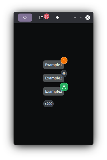
Badges with different sizes and colors
{
text: "Example1"
Maui.Badge
{
icon.name: "actor"
color: Maui.Theme.neutralBackgroundColor
anchors.horizontalCenter: parent.right
anchors.verticalCenter: parent.top
}
}
Property Documentation
◆ color
|
read |
◆ flat
◆ size
|
read |
The documentation for this class was generated from the following file:
This file is part of the KDE documentation.
Documentation copyright © 1996-2025 The KDE developers.
Generated on Fri May 2 2025 11:57:11 by doxygen 1.13.2 written by Dimitri van Heesch, © 1997-2006
Documentation copyright © 1996-2025 The KDE developers.
Generated on Fri May 2 2025 11:57:11 by doxygen 1.13.2 written by Dimitri van Heesch, © 1997-2006
KDE's Doxygen guidelines are available online.