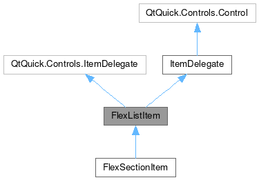
FlexListItem

Properties | |
| alias | columns |
| alias | columnSpacing |
| alias | content |
| alias | iconSizeHint |
| alias | iconSource |
| alias | imageSource |
| alias | label1 |
| alias | label2 |
| alias | label3 |
| alias | label4 |
| alias | rows |
| alias | rowSpacing |
| alias | template |
| bool | wide |
 Properties inherited from ItemDelegate Properties inherited from ItemDelegate | |
| alias | containsPress |
| alias | content |
| bool | draggable |
| bool | flat |
| bool | highlighted |
| alias | isCurrentItem |
| alias | mouseArea |
| int | radius |
| string | tooltipText |
Additional Inherited Members | |
 Signals inherited from ItemDelegate Signals inherited from ItemDelegate | |
| void | clicked (var mouse) |
| void | doubleClicked (var mouse) |
| void | pressAndHold (var mouse) |
| void | pressed (var mouse) |
| void | rightClicked (var mouse) |
Detailed Description
A template to position information next to a flexing right-content section, that wraps into a new line under constrained space conditions.
- Since
- org.mauikit.controls.labs 1.0

Notes
It is possible to manually set the number of columns to be used using the columns property, but this will break the auto wrapping functionality of the wide property. So consider using this property only if it is really needed to be forced.
You can find a more complete example at this link.
Definition at line 73 of file FlexListItem.qml.
Property Documentation
◆ columns
|
read |
This allows to manually set the number of columns to be used.
By default his value is set to 2 when it is wide, and to 1 otherwise.
- Warning
- Using this property will break the wrapping functionality via the
wideproperty.
Definition at line 143 of file FlexListItem.qml.
◆ columnSpacing
|
read |
The spacing of the columns, when the layout is not wrapped.
Definition at line 137 of file FlexListItem.qml.
◆ content
|
read |
The items declared as the children of this element will wrap into a new line on constrained spaces.
- Remarks
- This is the default property
- Note
- The content is handled by a RowLayout, so to position items use the Layout attached properties.
Definition at line 81 of file FlexListItem.qml.
◆ iconSizeHint
|
read |
The size hint for the icon container.
Definition at line 122 of file FlexListItem.qml.
◆ iconSource
|
read |
The icon name to be used in the information section.
Definition at line 112 of file FlexListItem.qml.
◆ imageSource
|
read |
The image source file to be used in the information section.
Definition at line 117 of file FlexListItem.qml.
◆ label1
|
read |
The Label element for the title.
Definition at line 92 of file FlexListItem.qml.
◆ label2
|
read |
The Label element for the message body.
Definition at line 97 of file FlexListItem.qml.
◆ label3
|
read |
The Label element for extra information positioned on the right top side.
Definition at line 102 of file FlexListItem.qml.
◆ label4
|
read |
The Label element for extra information positioned on the right bottom side.
Definition at line 107 of file FlexListItem.qml.
◆ rows
|
read |
This allows to manually set the number of rows to be used.
By default this uses maximum two [2] rows.
- Warning
- Using this property will break the wrapping functionality via the
wideproperty.
Definition at line 148 of file FlexListItem.qml.
◆ rowSpacing
|
read |
The spacing of the rows, when the layout is wrapped.
Definition at line 132 of file FlexListItem.qml.
◆ template
|
read |
An alias to the template element handling the information labels and image/icon.
- See also
- ListItemTemplate
Definition at line 87 of file FlexListItem.qml.
◆ wide
|
read |
Whether the layout will be wrapped into a new line or not.
If wide: true then a single line is used, but otherwise the layout is split into two lines, at the top the information labels and and the bottom all the children elements.
- See also
- content
Definition at line 127 of file FlexListItem.qml.
The documentation for this class was generated from the following file:
Documentation copyright © 1996-2025 The KDE developers.
Generated on Fri May 2 2025 11:57:11 by doxygen 1.13.2 written by Dimitri van Heesch, © 1997-2006
KDE's Doxygen guidelines are available online.