ItemDelegate
Properties | |
| alias | containsPress |
| alias | content |
| bool | draggable |
| bool | flat |
| bool | highlighted |
| alias | isCurrentItem |
| alias | mouseArea |
| int | radius |
| string | tooltipText |
Signals | |
| void | clicked (var mouse) |
| void | doubleClicked (var mouse) |
| void | pressAndHold (var mouse) |
| void | pressed (var mouse) |
| void | rightClicked (var mouse) |
Detailed Description
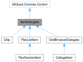
ItemDelegate is the base for the MauiKit delegate controls.
It is radically different from QQC2 ItemDelegate.
This controls inherits from QQC2 Control, to checkout its inherited properties refer to the Qt Docs.
This is just a container with some predefined features to allow items using it to be drag and drop, and allow long-press selection to trigger contextual actions.
Some of the controls that inherit from this are the GridBrowserDelegate adn ListBrowserDelegate.
Features
Setting up the drag and drop feature requires a few lines. To start you need to set draggable: true, and after that set up what the drag data will contain.:
Another feature is to react to a long-press - to emulate a "right-click" - sent by a touch gesture in a mobile device, where it could mean a request to launch some contextual action menu for the item.
- Attention
- The long-press can either launch the drag-and-drop (DnD) or the contextual request via the
pressAndHoldsignal. If after a long press the item is dragged while maintaining the pressed it will launch the DnD action, but if the long-press is released then it will launch the signalpressAndHold.
- See also
- pressAndHold
Definition at line 52 of file ItemDelegate.qml.
Property Documentation
◆ containsPress
|
read |
Whether the item is currently being pressed.
This is an alias to mouseArea.containsPress property.
Definition at line 108 of file ItemDelegate.qml.
◆ content
|
read |
The children items of this item will be place by default inside an Item.
- Remarks
- This is the default property
Ideally there is only one single child element. The children elements need to be positioned manually, using either anchors or coordinates and explicit sizes.
Definition at line 83 of file ItemDelegate.qml.
◆ draggable
|
read |
Whether the item should respond to a drag event after have been pressed for a long time.
If this is set to true, after the long press and a drag movement, the item contain will be captured as the Drag image source. And the drag target will be set to enable dropping the element. By default this is set to false.
Definition at line 96 of file ItemDelegate.qml.
◆ flat
|
read |
Whether the item should be styled as a flat element.
A flat element usually does not have any selected state or background. By default this property is set to `!Handy.isMobile"
- See also
- Handy::isMobile
Definition at line 124 of file ItemDelegate.qml.
◆ highlighted
|
read |
Whether the item is being highlighted.
A visual clue will be use to indicate the highlighted state. By default this is set to false.
Definition at line 113 of file ItemDelegate.qml.
◆ isCurrentItem
|
read |
Whether the item should be styled in a "selected/checked" state.
This is an alias to the highlighted property.
Definition at line 102 of file ItemDelegate.qml.
◆ mouseArea
|
read |
An alias to the MouseArea handling the press events.
- Remarks
- This property is read-only
- Note
- See Qt documentation on the MouseArea for more information.
Definition at line 90 of file ItemDelegate.qml.
◆ radius
|
read |
The border radius of the background.
@By default this is set to Style.radiusV, which picks the system preference for the radius of rounded elements corners.
Definition at line 118 of file ItemDelegate.qml.
◆ tooltipText
|
read |
The text used for the tool-tip, revealed when the item is hovered with the mouse cursor.
This type of text usually presents to the user with some extra information about the item.
Definition at line 65 of file ItemDelegate.qml.
Member Function Documentation
◆ clicked
|
signal |
Emitted when the item has been clicked - this means that the item has been pressed and then released.
- Parameters
-
mouse The object with the event information.
◆ doubleClicked
|
signal |
Emitted when the item has been double clicked in a short period of time.
- Parameters
-
mouse The object with the event information.
◆ pressAndHold
|
signal |
Emitted when the item has been pressed and hold for a few seconds.
- Parameters
-
mouse The object with the event information.
◆ pressed
|
signal |
Emitted when the item has been pressed.
- Parameters
-
mouse The object with the event information.
◆ rightClicked
|
signal |
Emitted when the item has been right clicked.
Usually with a mouse device.
- Parameters
-
mouse The object with the event information.
The documentation for this class was generated from the following file:
Documentation copyright © 1996-2025 The KDE developers.
Generated on Fri May 2 2025 11:57:11 by doxygen 1.13.2 written by Dimitri van Heesch, © 1997-2006
KDE's Doxygen guidelines are available online.