GridBrowserDelegate
Properties | |
| bool | autoExclusive |
| bool | checkable |
| bool | checked |
| alias | dropArea |
| alias | fillMode |
| alias | iconItem |
| alias | iconSizeHint |
| alias | iconSource |
| alias | iconVisible |
| alias | imageHeight |
| alias | imageSizeHint |
| alias | imageSource |
| alias | imageWidth |
| alias | label1 |
| alias | label2 |
| alias | labelsVisible |
| alias | maskRadius |
| alias | template |
 Properties inherited from ItemDelegate Properties inherited from ItemDelegate | |
| alias | containsPress |
| alias | content |
| bool | draggable |
| bool | flat |
| bool | highlighted |
| alias | isCurrentItem |
| alias | mouseArea |
| int | radius |
| string | tooltipText |
Signals | |
| void | contentDropped (var drop) |
| void | toggled (bool state) |
| Signals inherited from ItemDelegate | |
| void | clicked (var mouse) |
| void | doubleClicked (var mouse) |
| void | pressAndHold (var mouse) |
| void | pressed (var mouse) |
| void | rightClicked (var mouse) |
Detailed Description
A MauiKit ItemDelegate with some extra functionality and an informational column layout.
This controls inherits from MauiKit ItemDelegate, to checkout its inherited properties refer to docs.
- Note
- This is essentially different from QQC2 ItemDelegate control, where the QQC2 can have a text, an icon etc; this one is only a container with some predefined behavior.
- See also
- ItemDelegate
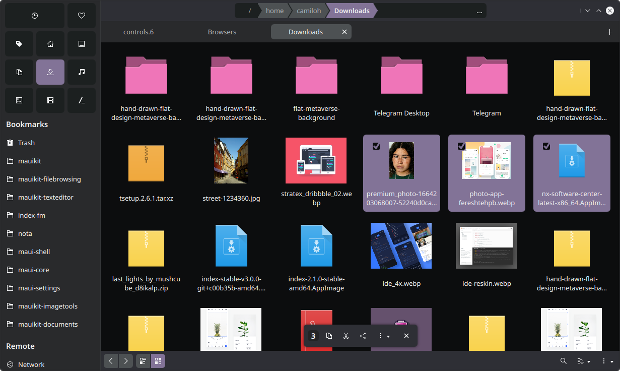
- Note
- An example of GridBrowserDelegates in the Index -file manager - application.
Structure
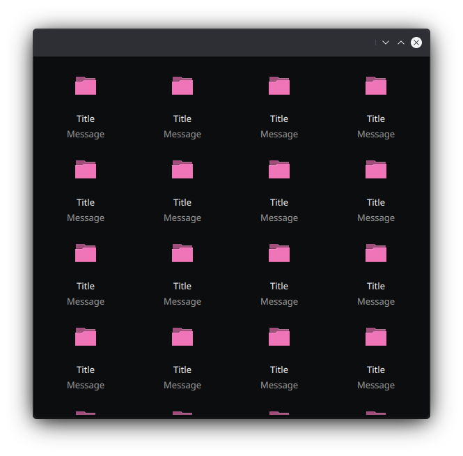
The GridBrowserDelegate layouts the information vertically. It's composed of three main sections: the top icon header, a title label and finally an extra label message. Those sections are all handled by a MauiKit GridItemTemplate control, which is exposed by the alias property template.
- See also
- GridItemTemplate
The top icon section is handled by default by a MauiKit IconItem, which hosts an image or icon. Those can be set via the imageSource or the iconSource properties.
- See also
- IconItem
The top icon header can also be replaced by any other component using the template.iconComponent property. An example of a custom icon header is the Mauikit controls GalleryItem and CollageItem, both of which inherit from GridBrowserDelegate and set a custom template.iconComponent.
Notes
This control can be checkable, and a CheckBox element will be placed on top of it. It also supports features from the Button type, such as the autoExclusive, checked properties and the press events.
By inheritance this component can be dragable.
- Note
- This control is usually used as the delegate component for the GridBrowser or QQC2 GridView.
Drag & Drop
To set up the drag and drop, use the Drag attached properties. The most relevant part for this control is to set the Drag.keys and Drag.mimeData
You can find a more complete example at this link.
Definition at line 100 of file GridBrowserDelegate.qml.
Property Documentation
◆ autoExclusive
|
read |
Whether the control should be auto exclusive, this means that among other related elements - sharing the same parent- only one can be selected/checked at the time.
By default this is set to false.
Definition at line 175 of file GridBrowserDelegate.qml.
◆ checkable
|
read |
Whether the control should become checkable.
If it is checkable a CheckBox element will become visible to allow to toggle between the checked states. By default this is set to false.
Definition at line 170 of file GridBrowserDelegate.qml.
◆ checked
|
read |
Whether the control is checked or not.
By default this is set to false.
Definition at line 157 of file GridBrowserDelegate.qml.
◆ dropArea
|
read |
An alias to expose the DropArea component in charge of the drag&drop events.
- See also
- contentDropped
- Remarks
- This property is read-only
Definition at line 181 of file GridBrowserDelegate.qml.
◆ fillMode
|
read |
- See also
- GridItemTemplate::fillMode
Definition at line 161 of file GridBrowserDelegate.qml.
◆ iconItem
|
read |
- See also
- GridItemTemplate::iconItem
Definition at line 128 of file GridBrowserDelegate.qml.
◆ iconSizeHint
|
read |
- See also
- GridItemTemplate::iconSizeHint
Definition at line 140 of file GridBrowserDelegate.qml.
◆ iconSource
|
read |
- See also
- GridItemTemplate::iconSource
Definition at line 148 of file GridBrowserDelegate.qml.
◆ iconVisible
|
read |
- See also
- GridItemTemplate::iconVisible
Definition at line 132 of file GridBrowserDelegate.qml.
◆ imageHeight
|
read |
- See also
- GridItemTemplate::imageHeight
Definition at line 189 of file GridBrowserDelegate.qml.
◆ imageSizeHint
|
read |
- See also
- GridItemTemplate::imageSizeHint
Definition at line 136 of file GridBrowserDelegate.qml.
◆ imageSource
|
read |
- See also
- GridItemTemplate::imageSource
Definition at line 144 of file GridBrowserDelegate.qml.
◆ imageWidth
|
read |
- See also
- GridItemTemplate::imageWidth
Definition at line 185 of file GridBrowserDelegate.qml.
◆ label1
|
read |
- See also
- GridItemTemplate::label1
- Remarks
- This property is read-only
Definition at line 119 of file GridBrowserDelegate.qml.
◆ label2
|
read |
- See also
- GridItemTemplate::label2
- Remarks
- This property is read-only
Definition at line 124 of file GridBrowserDelegate.qml.
◆ labelsVisible
|
read |
- See also
- GridItemTemplate::labelsVisible
Definition at line 152 of file GridBrowserDelegate.qml.
◆ maskRadius
|
read |
- See also
- GridItemTemplate::maskRadius
Definition at line 165 of file GridBrowserDelegate.qml.
◆ template
|
read |
An alias to access the GridItemTemplate control properties.
- Remarks
- This property is read-only
This is the template element that layouts all the information: labels and icon/image.
- See also
- GridItemTemplate
Definition at line 114 of file GridBrowserDelegate.qml.
Member Function Documentation
◆ contentDropped
|
signal |
Emitted when a drop event has been triggered on this control.
- Parameters
-
drop The object with information about the event.
◆ toggled
|
signal |
Emitted when the control checked state has been changed.
- Parameters
-
state The checked state value.
The documentation for this class was generated from the following file:
Documentation copyright © 1996-2025 The KDE developers.
Generated on Fri May 2 2025 11:57:11 by doxygen 1.13.2 written by Dimitri van Heesch, © 1997-2006
KDE's Doxygen guidelines are available online.