GridBrowser
Properties | |
| bool | adaptContent |
| alias | availableHeight |
| alias | availableWidth |
| alias | bottomPadding |
| alias | cacheBuffer |
| alias | cellHeight |
| alias | cellWidth |
| alias | contentHeight |
| alias | contentWidth |
| alias | contentY |
| alias | count |
| alias | currentIndex |
| alias | currentItem |
| alias | delegate |
| bool | enableLassoSelection |
| alias | flickable |
| alias | footer |
| alias | header |
| alias | holder |
| int | horizontalScrollBarPolicy |
| alias | itemHeight |
| alias | itemSize |
| alias | itemWidth |
| alias | lassoRec |
| alias | leftPadding |
| alias | model |
| alias | moving |
| alias | padding |
| bool | pinchEnabled |
| alias | rightPadding |
| alias | scrollView |
| bool | selectionMode |
| alias | topPadding |
| int | verticalScrollBarPolicy |
Signals | |
| void | areaClicked (var mouse) |
| void | areaRightClicked () |
| void | itemsSelected (var indexes) |
| void | keyPress (var event) |
Public Member Functions | |
| void | adaptGrid () |
| void | resetCellWidth () |
| void | resizeContent (factor) |
 Public Member Functions inherited from QtQuick.Item Public Member Functions inherited from QtQuick.Item | |
| childAt (real x, real y) | |
| bool | contains (point point) |
| dumpItemTree () | |
| forceActiveFocus () | |
| forceActiveFocus (Qt::FocusReason reason) | |
| bool | grabToImage (callback, targetSize) |
| point | mapFromGlobal (real x, real y) |
| point | mapFromItem (Item item, point p) |
| point | mapFromItem (Item item, real x, real y) |
| rect | mapFromItem (Item item, real x, real y, real width, real height) |
| rect | mapFromItem (Item item, rect r) |
| point | mapToGlobal (real x, real y) |
| point | mapToItem (Item item, point p) |
| point | mapToItem (Item item, real x, real y) |
| rect | mapToItem (Item item, real x, real y, real width, real height) |
| rect | mapToItem (Item item, rect r) |
| nextItemInFocusChain (bool forward) | |
Detailed Description
A browser view with a grid layout.
This controls inherits from QQC2 Item, to checkout its inherited properties refer to the Qt Docs.
This component might seem similar to QQC2 GridView - and it does uses it underneath - but this one includes a few more predefined elements, such as auto adaptable uniform cell width, a placeholder element, pinch to zoom gestures, and lasso selection support.
Structure
The browser has a dedicated placeholder element handled by MauiKit Holder, where a message can be set when the view is on a determined state the user should be warned about, such as if the view is empty, or not search results were found.
- See also
- Holder
The lasso selection feature works with a mouse or a track-pad, and allows to select multiple items in the browser-view that are under the lasso rectangle area. A signal is emitted when the selection has been triggered - this is when the lasso rectangle is released - sending as an argument an array of numbers representing the indexes of the selected items.
- See also
- itemsSelected
- Note
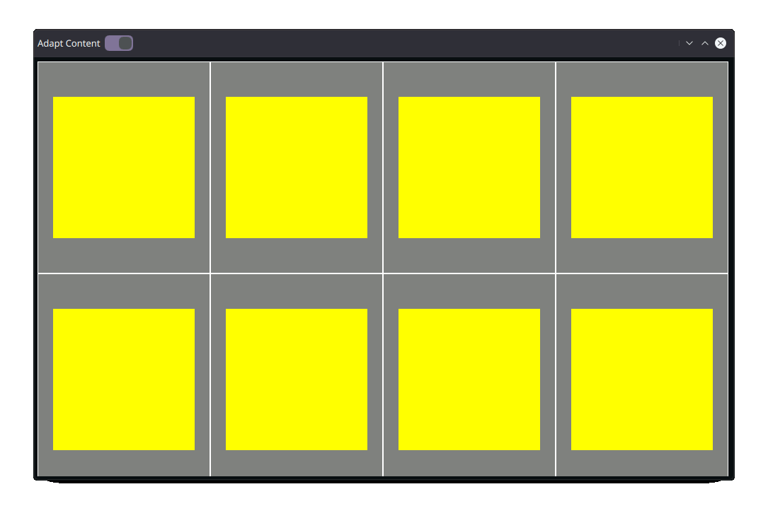
- Notice the yellow rectangles vs the grey ones. The yellow rectangles will preserve the
itemSizedimensions, while the cell area, represented by the gray rectangle, will vary. The example below demonstrates this behavior.
Notes
Use the itemSize property to set an uniform size for the cell item. At first the cellWidth will have the same value as the itemSize.
If the adaptContent is enabled, the cell width will vary, while the cell height will maintain the same value as the itemSize.
- See also
- adaptContent
When the view is resized and the adaptContent is enabled, the cell width - cellWidth - values will be updated to a value that can fill the width of the view-port uniformly. The modified values of the cellWidth will never be less than the value defined in the itemSize property.
- See also
- itemSize
- Warning
- Keep in mind that the
cellWidthvalues will be modified when enabling theadaptContentproperty. So any binding to this property will break.
- Note
- You can use the GridView attached properties to refer to the control properties from the delegates. For example, you could use
GridView.view.itemSizeor GridView.view.cellWidth`. *
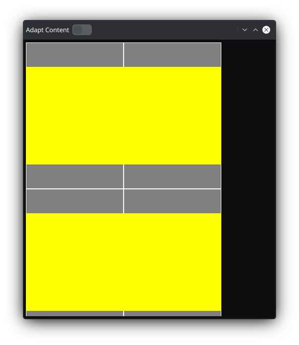
- Note
- Notice the yellow rectangles vs the grey ones. The yellow rectangles will preserve the
itemSizedimensions, and the cell width - as the gray area- will also keep the same dimensions asitemSize.
You can find a more complete example at this link.
Definition at line 107 of file GridBrowser.qml.
Property Documentation
◆ adaptContent
|
read |
Whether the width value of the cells should be recalculated when the view-port is resized.
This will result in a uniform set of cells. The minimum width of the cells is constrained by the itemSize property. By default this is set to true.
Definition at line 268 of file GridBrowser.qml.
◆ availableHeight
|
read |
The actual height of the view-port.
- Remarks
- This property is read-only
This is the actual height without any padding.
Definition at line 321 of file GridBrowser.qml.
◆ availableWidth
|
read |
The actual width of the view-port.
- Remarks
- This property is read-only
This is the actual width without any padding.
Definition at line 315 of file GridBrowser.qml.
◆ bottomPadding
|
read |
Bottom padding of the view.
This padding is added to the scroll view container.
- See also
- scrollView
Definition at line 217 of file GridBrowser.qml.
◆ cacheBuffer
|
read |
The cache buffer.
Refer to the QQC2 GridView documentation.
Definition at line 184 of file GridBrowser.qml.
◆ cellHeight
|
read |
The height size of the cell area.
This value is set to the itemHeight value, or itemSize if the formerly one has not been set. This value will not be modified by the adaptable behaviour. Notice you can make the cell bigger than the itemHeight, in order to create a sense of vertical padding for each cell element.
Definition at line 152 of file GridBrowser.qml.
◆ cellWidth
|
read |
The width size of the cell area.
- Warning
- This value will be modified when the viewport area is resized and the
adaptContentis enabled. So any binding will be lost. To have a fixed cell width value, setadaptContent: false.
- See also
- adaptContent
Definition at line 144 of file GridBrowser.qml.
◆ contentHeight
|
read |
The total height of all the elements listed in the view.
Definition at line 195 of file GridBrowser.qml.
◆ contentWidth
|
read |
The total width of all the elements.
Definition at line 200 of file GridBrowser.qml.
◆ contentY
|
read |
The position of the view contents on the Y axis.
Definition at line 168 of file GridBrowser.qml.
◆ count
|
read |
The total amount of elements listed in the view.
Definition at line 178 of file GridBrowser.qml.
◆ currentIndex
|
read |
The index number of the current element selected.
Definition at line 173 of file GridBrowser.qml.
◆ currentItem
|
read |
The current item selected.
Definition at line 297 of file GridBrowser.qml.
◆ delegate
|
read |
The component to be used as the delegate.
- Note
- Consider using the MauiKit delegate controls, such as GridBrowserDelegate, GalleryRollItem or CollageItem.
Definition at line 163 of file GridBrowser.qml.
◆ enableLassoSelection
|
read |
Whether to enable the lasso selection, to select multiple items.
By default this is set to false.
- See also
- itemsSelected
Definition at line 277 of file GridBrowser.qml.
◆ flickable
|
read |
The element controlling the layout fo element, AKA the flickable element.
This is an alias to the QQC2 GridView control.
Definition at line 190 of file GridBrowser.qml.
◆ footer
|
read |
The footer section of the GridView element.
- See also
- flickable
Definition at line 309 of file GridBrowser.qml.
◆ header
|
read |
The header section of the GridView element.
- See also
- flickable
Definition at line 303 of file GridBrowser.qml.
◆ holder
|
read |
An alias to access the placeholder properties.
This is handled by a MauiKit Holder.
- See also
- Holder::title
- Holder::body
Definition at line 263 of file GridBrowser.qml.
◆ horizontalScrollBarPolicy
|
read |
The policy of the horizontal scroll bar from the scroll view.
- See also
- scrollView The default value of this is picked based on the Style property
Style.scrollBarPolicy, unless the orientation of the view is set to vertical, in which case this is set to 'ScrollBar.AlwaysOff`. Possible values are:- ScrollBar.AlwaysOff
- ScrollBar.AlwaysOn
- ScrollBar.AsNeeded
Definition at line 255 of file GridBrowser.qml.
◆ itemHeight
|
read |
The height of the element in the cell.
This value will vary even if adaptContent is enabled. This value is used as the cellHeight value by default.
Definition at line 136 of file GridBrowser.qml.
◆ itemSize
|
read |
The uniform size of the element in the cell.
This value is used for the width and height. This value will stay the same even when the width of the cell changes.
The dimensions of the item can be changed manually for its height and its width.
- See also
- itemHeight
- itemWidth
- Note
- This is meant to set an initial uniform size, so notice this value will be use for the
cellWidth,cellHeight,itemHeightanditemWidth.
Definition at line 124 of file GridBrowser.qml.
◆ itemWidth
|
read |
The width of the element in the cell.
This value will vary even if adaptContent is enabled. This value is used as the cellWidth value by default.
Definition at line 130 of file GridBrowser.qml.
◆ lassoRec
|
read |
An alias to the lasso rectangle.
- Remarks
- This property is read-only
Definition at line 287 of file GridBrowser.qml.
◆ leftPadding
|
read |
Left padding of the view.
This padding is added to the scroll view container.
- See also
- scrollView
Definition at line 229 of file GridBrowser.qml.
◆ model
|
read |
The model to be used to populate the browsing view.
Definition at line 157 of file GridBrowser.qml.
◆ moving
|
read |
Whether the view is moving horizontally or vertically.
- Remarks
- This property is read-only
This reacts to changes in the content Y and/or X axis.
- See also
- contentY
- contentX
Definition at line 329 of file GridBrowser.qml.
◆ padding
|
read |
Padding of the view.
This padding is added to the scroll view container.
- See also
- scrollView
Definition at line 235 of file GridBrowser.qml.
◆ pinchEnabled
|
read |
Whether the pinch-to-zoom gesture is enabled.
By default this is set to false.
Definition at line 292 of file GridBrowser.qml.
◆ rightPadding
|
read |
Right padding of the view.
This padding is added to the scroll view container.
- See also
- scrollView
Definition at line 223 of file GridBrowser.qml.
◆ scrollView
|
read |
An alias to the QQC2 ScrollView element attached to the view.
Definition at line 205 of file GridBrowser.qml.
◆ selectionMode
|
read |
Definition at line 281 of file GridBrowser.qml.
◆ topPadding
|
read |
Top padding of the view.
This padding is added to the scroll view container.
- See also
- scrollView
Definition at line 211 of file GridBrowser.qml.
◆ verticalScrollBarPolicy
|
read |
The policy of the vertical scroll bar from the scroll view.
- See also
- scrollView The default value of this is picked based on the Style property
Style.scrollBarPolicy, unless the orientation of the view is set to horizontal, in which case this is set to 'ScrollBar.AlwaysOff`. Possible values are:- ScrollBar.AlwaysOff
- ScrollBar.AlwaysOn
- ScrollBar.AsNeeded
Definition at line 245 of file GridBrowser.qml.
Member Function Documentation
◆ adaptGrid()
| void GridBrowser::adaptGrid | ( | ) |
Forces to adapt the width of the grid cells.
This will result on the cellWidth property being modified.
◆ areaClicked
|
signal |
Emitted when an empty space of the background area has been clicked.
- Parameters
-
mouse Object with information about the click event.
◆ areaRightClicked
|
signal |
Emitted when an empty space of the area area background has been right clicked.
◆ itemsSelected
|
signal |
Emitted when the lasso selection has been released.
- Parameters
-
indexes A array of index numbers is sent as the argument, representing the index value of the items under the lasso rectangle area.
◆ keyPress
|
signal |
Emitted when a physical key from the device has been pressed.
- Parameters
-
event The object with information about the event.
◆ resetCellWidth()
| void GridBrowser::resetCellWidth | ( | ) |
Resets the value of the cellWidth back to the initial size set with itemSize.
◆ resizeContent()
| void GridBrowser::resizeContent | ( | factor | ) |
Request to resize the view elements.
This will result in the itemSize property being modified.
- Parameters
-
factor a factor for resizing. The minimum size is Style.iconSizes.small.
The documentation for this class was generated from the following file:
Documentation copyright © 1996-2025 The KDE developers.
Generated on Fri May 2 2025 11:57:11 by doxygen 1.13.2 written by Dimitri van Heesch, © 1997-2006
KDE's Doxygen guidelines are available online.