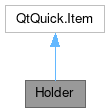
Holder

Properties | |
| list< Action > | actions |
| alias | body |
| alias | content |
| alias | dropArea |
| string | emoji |
| int | emojiSize |
| string | imageSource |
| bool | isGif |
| bool | isMask |
| alias | label1 |
| alias | label2 |
| alias | title |
Signals | |
| void | contentDropped (var drop) |
Additional Inherited Members | |
 Public Member Functions inherited from QtQuick.Item Public Member Functions inherited from QtQuick.Item | |
| childAt (real x, real y) | |
| bool | contains (point point) |
| dumpItemTree () | |
| forceActiveFocus () | |
| forceActiveFocus (Qt::FocusReason reason) | |
| bool | grabToImage (callback, targetSize) |
| point | mapFromGlobal (real x, real y) |
| point | mapFromItem (Item item, point p) |
| point | mapFromItem (Item item, real x, real y) |
| rect | mapFromItem (Item item, real x, real y, real width, real height) |
| rect | mapFromItem (Item item, rect r) |
| point | mapToGlobal (real x, real y) |
| point | mapToItem (Item item, point p) |
| point | mapToItem (Item item, real x, real y) |
| rect | mapToItem (Item item, real x, real y, real width, real height) |
| rect | mapToItem (Item item, rect r) |
| nextItemInFocusChain (bool forward) | |
Detailed Description
Holder A component meant to be used as a placeholder element with support for a title, message body, icon image - animated or not -, and a set of contextual actions.
This controls inherits from QQC2 Item, to checkout its inherited properties refer to the Qt Docs.
This control is meant to display messages, such as warning messages with a title and icon, and with a set of possible actions. The default content children of this component are QQC2 Actions.

Notes
By default the icon is supossed to be symbolic and will be colored - if a colorful icon is to be used, the coloring mask should toggle off.
It is possible to add an animated image source as the icon. To enable the animation toggle on the animation property.
- See also
- isGif
You can find a more complete example at this link.
Definition at line 71 of file Holder.qml.
Property Documentation
◆ actions
|
read |
A list of contextual actions.
By default this control takes a list of QQC2 Actions as the children. The actions will be represented as a column of button under the title and message.
- Remarks
- This is the default property
Definition at line 79 of file Holder.qml.
◆ body
|
read |
The body message of the place holder element.
Definition at line 116 of file Holder.qml.
◆ content
|
read |
An alias to add children elements to the bottom of the default layout container.
Definition at line 98 of file Holder.qml.
◆ dropArea
|
read |
Alias to the DropArea exposed to tweak its properties.
- Remarks
- This property is read-only
Definition at line 149 of file Holder.qml.
◆ emoji
|
read |
The icon source to be used as the heading.
Definition at line 102 of file Holder.qml.
◆ emojiSize
|
read |
The size of the icon/image used as the emoji.
By default this value is set to Style.iconSizes.big.
Definition at line 130 of file Holder.qml.
◆ imageSource
|
read |
The image to be used as the heading.
Definition at line 106 of file Holder.qml.
◆ isGif
|
read |
Whether the emoji source is an animated image file.
By default this is set to false.
Definition at line 125 of file Holder.qml.
◆ isMask
|
read |
Whether the image/icon should be masked and tinted with the text color.
If the emoji is set to a colorful source, then this should be set to false.
Definition at line 120 of file Holder.qml.
◆ label1
|
read |
The Label element used as the title.
This is exposed so the title label properties can be tweaked, such as making the font bolder, lighter or changing its color or size.
- See also
- title
Definition at line 137 of file Holder.qml.
◆ label2
|
read |
The Label element used as the message body.
This is exposed so the body message label properties can be tweaked, such as making the font bolder, lighter or changing its color or size.
- See also
- body
Definition at line 144 of file Holder.qml.
◆ title
|
read |
The title of the place holder element.
Definition at line 111 of file Holder.qml.
Member Function Documentation
◆ contentDropped
|
signal |
Emitted when a drop event has occurred.
- Parameters
-
drop the drop object with the event information
The documentation for this class was generated from the following file:
Documentation copyright © 1996-2025 The KDE developers.
Generated on Fri May 2 2025 11:57:11 by doxygen 1.13.2 written by Dimitri van Heesch, © 1997-2006
KDE's Doxygen guidelines are available online.