Chip
Chip Class Reference
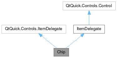
Inheritance diagram for Chip:

Properties | |
| color | color |
| alias | iconSource |
| alias | imageSource |
| alias | label |
| bool | showCloseButton |
 Properties inherited from ItemDelegate Properties inherited from ItemDelegate | |
| alias | containsPress |
| alias | content |
| bool | draggable |
| bool | flat |
| bool | highlighted |
| alias | isCurrentItem |
| alias | mouseArea |
| int | radius |
| string | tooltipText |
Signals | |
| void | close () |
 Signals inherited from ItemDelegate Signals inherited from ItemDelegate | |
| void | clicked (var mouse) |
| void | doubleClicked (var mouse) |
| void | pressAndHold (var mouse) |
| void | pressed (var mouse) |
| void | rightClicked (var mouse) |
Detailed Description
This an information element, similar to a button, but more compact.
- Since
- org.mauikit.controls 1.0
Chips allow users to enter information, make selections, filter content, or trigger actions. While buttons are expected to appear consistently and with familiar calls to action, chips should appear dynamically as a group of multiple interactive elements.
This component is similar to the MauiKit Badge control, but this one is interactive.
- See also
- Badge

Colorful chips
Flow
{
width: 400
anchors.centerIn: parent
spacing: Maui.Style.space.big
Maui.Chip
{
text: "Chip1"
color: "#757575"
}
Maui.Chip
{
text: "Chip2"
icon.name: "actor"
color: "#03A9F4"
}
Maui.Chip
{
text: "Chip3"
icon.name: "anchor"
color: "#4CAF50"
}
Maui.Chip
{
text: "Chip4"
color: "#E1BEE7"
}
Maui.Chip
{
text: "Chip5"
color: "#FFC107"
}
Maui.Chip
{
text: "Chip6"
color: "#607D8B"
}
Maui.Chip
{
text: "Chip7"
color: "#FF5722"
icon.source: "/home/camiloh/Downloads/5911329.jpeg"
}
}
Property Documentation
◆ color
|
read |
◆ iconSource
|
read |
◆ imageSource
|
read |
◆ label
|
read |
◆ showCloseButton
|
read |
Member Function Documentation
◆ close
|
signal |
Emitted once the close button is clicked.
To enable the close button see the showCloseButton: true property.
- See also
- showCloseButton
The documentation for this class was generated from the following file:
This file is part of the KDE documentation.
Documentation copyright © 1996-2025 The KDE developers.
Generated on Fri May 2 2025 11:57:11 by doxygen 1.13.2 written by Dimitri van Heesch, © 1997-2006
Documentation copyright © 1996-2025 The KDE developers.
Generated on Fri May 2 2025 11:57:11 by doxygen 1.13.2 written by Dimitri van Heesch, © 1997-2006
KDE's Doxygen guidelines are available online.