InfoDialog
Properties | |
| alias | content |
| alias | message |
| alias | template |
 Properties inherited from Dialog Properties inherited from Dialog | |
| real | absoluteMaximumHeight |
| real | absoluteMaximumWidth |
| listTAction | customFooterActions |
| alias | dialogChildren |
| alias | dialogData |
| bool | flatFooterButtons |
| Component | footerLeadingComponent |
| Component | footerTrailingComponent |
| real | maximumHeight |
| real | maximumWidth |
| real | preferredHeight |
| real | preferredWidth |
| bool | showCloseButton |
Public Member Functions | |
| void | alert (message, level) |
| Public Member Functions inherited from QtQuick.Controls.Dialog | |
| void | accept () |
| accepted () | |
| applied () | |
| discarded () | |
| void | done (int result) |
| helpRequested () | |
| void | reject () |
| rejected () | |
| reset () | |
| AbstractButton | standardButton (StandardButton button) |
Detailed Description
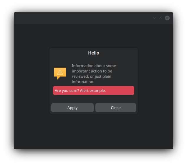
A Dialog with a built-in template container for displaying information, with a title, image and message body.
This controls inherits from QQC2 Dialog, to checkout its inherited properties refer to the Qt Docs.
Structure
The dialog container is handled by a MauiKit ScrollColumn - which by default is flickable - so any contents added as children of this dialog will be put inside of it and become scrollable/flickable.
- Note
- For the scrollable behaviour to work correctly the child element needs to have an
implicitHeightsize set, and further positioning options should use the Layout attached properties: for filling the with useLayout.fillWidth: true.
The InfoDialog uses the ListItemTemplate control to display the information labels and image/icon, this is exposed via the template property for further tweaking.
- See also
- template
To set the title use the title property. For the message body use the exposed alias property message, or the template.text2 property, which are the same. To set an icon or image use the alias template property, for example template.iconSource: "dialog-warning".
- See also
- ListItemTemplate
- Attention
- By default the only action button is set to
standardButtons: Dialog.Close. To know more about other standard button types checkout the Dialog documentation on Qt page.
And finally, the dialog can display an inline notification alert upon request via the alert() function.
- Remarks
- This alert message is positioned at the bottom part and colored according to the emergency level set. This is useful when the dialog needs to warn the user about certain action.
- See also
- alert

You can find a more complete example at this link.
Definition at line 59 of file InfoDialog.qml.
Property Documentation
◆ content
|
read |
The default content of the dialog.
- Remarks
- This is the default property
The children elements of this control will be positioned inside a Mauikit ScrollColumn.
- Note
- To position child elements use the Layout attached properties.
- See also
- InfoDialog#structure
Definition at line 68 of file InfoDialog.qml.
◆ message
|
read |
The message body.
Definition at line 73 of file InfoDialog.qml.
◆ template
|
read |
The templated item used for the default dialog message, holding the icon emblem and the message body.
This property gives access to the template for more detailed tweaking, by adding items or changing its properties.
Definition at line 79 of file InfoDialog.qml.
Member Function Documentation
◆ alert()
| void InfoDialog::alert | ( | message | , |
| level | ) |
Sends an inline alert notification that is displayed in the dialog.
- Parameters
-
message The text for the message. Keep it short if possible. level Depending on the level the color may differ. The levels are: - 0 positive
- 1 neutral
- 2 negative
The documentation for this class was generated from the following file:
Documentation copyright © 1996-2025 The KDE developers.
Generated on Fri May 2 2025 11:57:11 by doxygen 1.13.2 written by Dimitri van Heesch, © 1997-2006
KDE's Doxygen guidelines are available online.