ContextualHelpButton
ContextualHelpButton Class Reference
Properties | |
| alias | toolTipText |
| bool | toolTipVisible |
Detailed Description
An inline help button that shows a tooltip when clicked.
Use this component when you want to explain details or usage of a feature of the UI, but the explanation is too long to fit in an inline label, and too important to put in a hover tooltip and risk the user missing it.
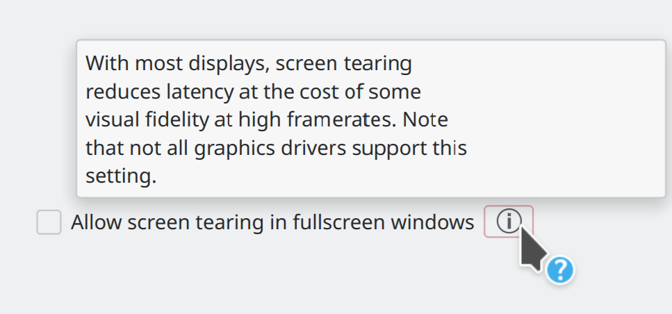
Example of ContextualHelpButton usage
Example usage:
import QtQuick.Controls as QQC2
import QtQuick.Layouts
import org.kde.kirigami as Kirigami
RowLayout {
spacing: Kirigami.Units.smallSpacing
QQC2.CheckBox {
text: i18n("Allow screen tearing in fullscreen windows")
}
Kirigami.ContextualHelpButton {
toolTipText: i18n("With most displays, screen tearing reduces latency at the cost of some visual fidelity at high framerates. Note that not all graphics drivers support this setting.")
}
}
QString i18n(const char *text, const TYPE &arg...)
Definition at line 41 of file ContextualHelpButton.qml.
Property Documentation
◆ toolTipText
|
read |
Definition at line 44 of file ContextualHelpButton.qml.
◆ toolTipVisible
|
read |
Definition at line 46 of file ContextualHelpButton.qml.
The documentation for this class was generated from the following file:
This file is part of the KDE documentation.
Documentation copyright © 1996-2025 The KDE developers.
Generated on Fri May 2 2025 12:02:16 by doxygen 1.13.2 written by Dimitri van Heesch, © 1997-2006
Documentation copyright © 1996-2025 The KDE developers.
Generated on Fri May 2 2025 12:02:16 by doxygen 1.13.2 written by Dimitri van Heesch, © 1997-2006
KDE's Doxygen guidelines are available online.