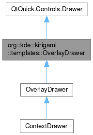
org::kde::kirigami::templates::OverlayDrawer

Properties | |
| bool | animating |
| bool | collapsed |
| int | collapsedSize |
| bool | collapsible |
| bool | drawerOpen |
| Item | handle |
| KTPIconPropertiesGroup | handleClosedIcon |
| string | handleClosedToolTip |
| KTPIconPropertiesGroup | handleOpenIcon |
| string | handleOpenToolTip |
| bool | handleVisible |
| bool | peeking |
Detailed Description
Overlay Drawers are used to expose additional UI elements needed for small secondary tasks for which the main UI elements are not needed.
For example in Okular Mobile, an Overlay Drawer is used to display thumbnails of all pages within a document along with a search field. This is used for the distinct task of navigating to another page.
Import Statement
- Version
- 2.2
Definition at line 22 of file templates/OverlayDrawer.qml.
Property Documentation
◆ animating
|
read |
This property tells whether the drawer is currently opening or closing itself.
- Remarks
- This property is read-only
Definition at line 46 of file templates/OverlayDrawer.qml.
◆ collapsed
|
read |
This property tells whether the drawer is collapsed to a very thin sidebar, usually icon only.
When true, the drawer will be collapsed to a very thin sidebar, usually icon only.
default: false
- See also
- collapsible Only collapsible drawers can be collapsed.
Definition at line 68 of file templates/OverlayDrawer.qml.
◆ collapsedSize
|
read |
This property holds the size of the collapsed drawer.
For vertical drawers this will be the width of the drawer and for horizontal drawers this will be the height of the drawer.
default: Units.iconSizes.medium, just enough to accommodate medium sized icons
Definition at line 77 of file templates/OverlayDrawer.qml.
◆ collapsible
|
read |
This property holds whether the drawer can be collapsed to a very thin, usually icon only sidebar.
Only modal drawers are collapsible. Collapsible is not supported in the mobile mode.
- Since
- 2.5
Definition at line 56 of file templates/OverlayDrawer.qml.
◆ drawerOpen
|
read |
This property tells whether the drawer is open and visible.
default: false
Definition at line 30 of file templates/OverlayDrawer.qml.
◆ handle
|
read |
Readonly property that points to the item that will act as a physical handle for the Drawer.
- Remarks
- This property is read-only
Definition at line 136 of file templates/OverlayDrawer.qml.
◆ handleClosedIcon
|
read |
This property holds the options for the handle's close icon.
This is a grouped property with the following components:
source: var: The name of a freedesktop-compatible icon.color: color: An optional tint color for the icon.
If no custom icon is set, an X icon is shown, which will morph into the Menu or overflow icons.
For OverlayDrawer the default is view-right-new or view-left-new depending on the drawer location.
- Since
- 2.5
Definition at line 112 of file templates/OverlayDrawer.qml.
◆ handleClosedToolTip
|
read |
This property holds the tooltip displayed when the drawer is closed.
- Since
- 2.15
Definition at line 122 of file templates/OverlayDrawer.qml.
◆ handleOpenIcon
|
read |
This property holds the options for handle's open icon.
This is a grouped property with following components:
source: var: The name of a freedesktop-compatible icon.color: color: An optional tint color for the icon.
If no custom icon is set, a menu icon is shown for the application globalDrawer and an overflow menu icon is shown for the contextDrawer. That's the default for the GlobalDrawer and ContextDrawer components respectively.
For OverlayDrawer the default is view-right-close or view-left-close depending on the drawer location
- Since
- 2.5
- Remarks
- This property is read-only
Definition at line 96 of file templates/OverlayDrawer.qml.
◆ handleOpenToolTip
|
read |
This property holds the tooltip displayed when the drawer is open.
- Since
- 2.15
Definition at line 117 of file templates/OverlayDrawer.qml.
◆ handleVisible
|
read |
This property holds whether the handle is visible, to make opening the drawer easier.
Currently supported only on left and right drawers.
Definition at line 129 of file templates/OverlayDrawer.qml.
◆ peeking
|
read |
This property tells whether the drawer is in a state between open and closed.
The drawer is visible but not completely open. This is usually the case when the user is dragging the drawer from a screen edge, so the user is "peeking" at what's in the drawer.
default: false
Definition at line 41 of file templates/OverlayDrawer.qml.
The documentation for this class was generated from the following file:
Documentation copyright © 1996-2025 The KDE developers.
Generated on Fri May 2 2025 12:02:16 by doxygen 1.13.2 written by Dimitri van Heesch, © 1997-2006
KDE's Doxygen guidelines are available online.