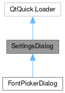
SettingsDialog

Properties | |
| list< QtObject > | content |
Public Member Functions | |
| void | addPage (component, properties) |
| void | open () |
 Public Member Functions inherited from QtQuick.Loader Public Member Functions inherited from QtQuick.Loader | |
| loaded () | |
| object | setSource (url source, object properties) |
Detailed Description
A popup page with a scrollable vertical layout, and support for a stack of multiple pages.
The default container fo this control is a MauiKit SettingsPage, and the popup will snap to the window full size on constrained spaces.
- See also
- SettingsPage
You can add multiple sub pages to this control by making use of the SettingsPage control and the addPage function. By using the SettingsPage you can expect to have a way to navigate between the control sub pages. The code snippet below shows a quick demo on how to do it.
- See also
- addPage

- Note
- This control is mostly use for presenting a group of configuration settings to the user. Usually it is populated with sections SectionGroup containing FlexSectionItem.
You can find a more complete example at this link.
Definition at line 125 of file SettingsDialog.qml.
Property Documentation
◆ content
|
read |
By default all the children content will be placed into a MauiKit SettingsPage, which has a scrollable column layout.
- Remarks
- This is the default property
Definition at line 132 of file SettingsDialog.qml.
Member Function Documentation
◆ addPage()
| void SettingsDialog::addPage | ( | component | , |
| properties | ) |
Adds a new sub page to the control.
Use a MauiKit SettingsPage for the component.
- Parameters
-
component the QQC2 Component wrapping a MauiKit SettingsPage properties optional properties map for the newly added sub page component
- Note
- The optional properties argument specifies a map of initial property values for the pushed item. For dynamically created items, these values are applied before the creation is finalized. This is more efficient than setting property values after creation, particularly where large sets of property values are defined, and also allows property bindings to be set up (using Qt.binding()) before the item is created. Checkout QT documentation on the StackView methods.
The documentation for this class was generated from the following file:
Documentation copyright © 1996-2024 The KDE developers.
Generated on Fri May 17 2024 11:56:16 by doxygen 1.10.0 written by Dimitri van Heesch, © 1997-2006
KDE's Doxygen guidelines are available online.