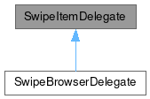
SwipeItemDelegate

Properties | |
| alias | actionRow |
| int | buttonsHeight |
| bool | collapse |
| alias | content |
| list< Action > | quickActions |
| bool | showQuickActions |
Detailed Description
A template base for presenting an upper and under layer of content.
This control inherits from MauiKit ItemDelegate, to checkout its inherited properties refer to the docs.
This control is divided into two sections. First, is the content, which are the elements declared ans the children of this. Those elements are always placed in the surface.
- See also
- content Second is a set of QQC2 Action that go to the far right side - either in the superior or inferior surface. That behavior will depend on the
collapseproperty value - wherecollapse : truemeans it will be displayed under the surface.
- Note
- When the quick actions are displayed above in the surface, they will only be discovered upon hovering, otherwise they will stay hidden.
You can review the SwipeBrowserDelegate which serves as an example of how to use this control.
- See also
- SwipeBrowserDelegate
Definition at line 41 of file SwipeItemDelegate.qml.
Property Documentation
◆ actionRow
|
read |
Exposed to quickly append more items to the right side of this control in the far right area.
Definition at line 64 of file SwipeItemDelegate.qml.
◆ buttonsHeight
|
read |
The implicit height of the underneath area containing the action button.
- Remarks
- This property is read-only
Definition at line 49 of file SwipeItemDelegate.qml.
◆ collapse
|
read |
Whether the actions will go underneath the control or above.
By default this depends on the available space, so it can fit the information labels and the quickAction buttons.
Definition at line 78 of file SwipeItemDelegate.qml.
◆ content
|
read |
The default content children has to be positioned manually, making use of anchors, etc.
- Remarks
- This is the default property
Definition at line 58 of file SwipeItemDelegate.qml.
◆ quickActions
|
read |
The actions that goes underneath the control and is revealed by swiping to the left when the collapse property is set to true, otherwise the actions will be shown in the far right side above.
Definition at line 73 of file SwipeItemDelegate.qml.
◆ showQuickActions
|
read |
Whether the quick actions declared as quickActions should be visible or not.
By default this is set to true
Definition at line 69 of file SwipeItemDelegate.qml.
The documentation for this class was generated from the following file:
Documentation copyright © 1996-2025 The KDE developers.
Generated on Fri May 2 2025 11:57:11 by doxygen 1.13.2 written by Dimitri van Heesch, © 1997-2006
KDE's Doxygen guidelines are available online.