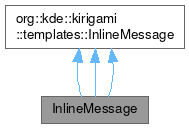
InlineMessage

Additional Inherited Members | |
 Public Types inherited from org::kde::kirigami::templates::InlineMessage Public Types inherited from org::kde::kirigami::templates::InlineMessage | |
| enum class | Position { Inline , Header , Footer } |
 Properties inherited from org::kde::kirigami::templates::InlineMessage Properties inherited from org::kde::kirigami::templates::InlineMessage | |
| listTAction | actions |
| bool | animating |
| alias | hoveredLink |
| TPIconPropertiesGroup | icon |
| int | position |
| bool | showCloseButton |
| string | text |
| int | type |
 Signals inherited from org::kde::kirigami::templates::InlineMessage Signals inherited from org::kde::kirigami::templates::InlineMessage | |
| void | linkActivated (string link) |
| void | linkHovered (string link) |
Detailed Description
An inline message item with support for informational, positive, warning and error types, and with support for associated actions.
InlineMessage can be used to give information to the user or interact with the user, without requiring the use of a dialog.
The InlineMessage item is hidden by default. It also manages its height (and implicitHeight) during an animated reveal when shown. You should avoid setting height on an InlineMessage unless it is already visible.
Optionally an icon can be set, defaulting to an icon appropriate to the message type otherwise.
Optionally a close button can be shown.
Actions are added from left to right. If more actions are set than can fit, an overflow menu is provided.
Example usage:
- Since
- 5.45
Definition at line 61 of file controls/InlineMessage.qml.
The documentation for this class was generated from the following files:
Documentation copyright © 1996-2025 The KDE developers.
Generated on Fri May 2 2025 12:02:16 by doxygen 1.13.2 written by Dimitri van Heesch, © 1997-2006
KDE's Doxygen guidelines are available online.