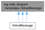
org::kde::kirigami::templates::InlineMessage

Public Types | |
| enum class | Position { Inline , Header , Footer } |
Properties | |
| listTAction | actions |
| bool | animating |
| alias | hoveredLink |
| TPIconPropertiesGroup | icon |
| int | position |
| bool | showCloseButton |
| string | text |
| int | type |
Signals | |
| void | linkActivated (string link) |
| void | linkHovered (string link) |
Detailed Description
An inline message item with support for informational, positive, warning and error types, and with support for associated actions.
InlineMessage can be used to give information to the user or interact with the user, without requiring the use of a dialog.
The InlineMessage item is hidden by default. It also manages its height (and implicitHeight) during an animated reveal when shown. You should avoid setting height on an InlineMessage unless it is already visible.
Optionally an icon can be set, defaulting to an icon appropriate to the message type otherwise.
Optionally a close button can be shown.
Actions are added from left to right. If more actions are set than can fit, an overflow menu is provided.
Example:
- Since
- 5.45
Import Statement
import org.kde.kirigami.templates
- Version
- 2.4
Definition at line 66 of file controls/templates/InlineMessage.qml.
Member Enumeration Documentation
◆ Position
|
strong |
Defines a position for the message: whether it's to be used as an inline component inside the page, a page header, or a page footer.
Definition at line 73 of file controls/templates/InlineMessage.qml.
Property Documentation
◆ actions
|
read |
This property holds the list of actions to show.
Actions are added from left to right. If more actions are set than can fit, an overflow menu is provided.
Definition at line 133 of file controls/templates/InlineMessage.qml.
◆ animating
|
read |
This property holds whether the current message item is animating.
- Remarks
- This property is read-only
Definition at line 138 of file controls/templates/InlineMessage.qml.
◆ hoveredLink
|
read |
This property holds the link embedded in the message text that the user is hovering over.
- Remarks
- This property is read-only
Definition at line 101 of file controls/templates/InlineMessage.qml.
◆ icon
|
read |
This grouped property holds the description of an optional icon.
- source: The source of the icon, a freedesktop-compatible icon name is recommended.
- color: An optional tint color for the icon.
If no custom icon is set, an icon appropriate to the message type is shown.
Definition at line 117 of file controls/templates/InlineMessage.qml.
◆ position
|
read |
Adjust the look of the message based upon the position.
If a message is positioned in the header area or in the footer area of a page, it might be desirable to not have borders but just a line separating it from the content area. In this case, use the Header or Footer position. Default is InlineMessage.Position.Inline
Definition at line 86 of file controls/templates/InlineMessage.qml.
◆ showCloseButton
|
read |
This property holds whether the close button is displayed.
The default is false.
Definition at line 127 of file controls/templates/InlineMessage.qml.
◆ text
|
read |
This property holds the message text.
Definition at line 121 of file controls/templates/InlineMessage.qml.
◆ type
|
read |
This property holds the message type.
One of Information, Positive, Warning or Error.
The default is Kirigami.MessageType.Information.
Definition at line 107 of file controls/templates/InlineMessage.qml.
Member Function Documentation
◆ linkActivated
|
signal |
This signal is emitted when a link is clicked or tapped in the message text.
- Parameters
-
The clicked or tapped link.
◆ linkHovered
|
signal |
This signal is emitted when a link is hovered in the message text.
- Parameters
-
The hovered link.
The documentation for this class was generated from the following file:
Documentation copyright © 1996-2025 The KDE developers.
Generated on Fri May 2 2025 12:02:16 by doxygen 1.13.2 written by Dimitri van Heesch, © 1997-2006
KDE's Doxygen guidelines are available online.