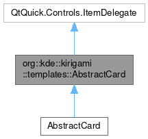
org::kde::kirigami::templates::AbstractCard

Properties | |
| alias | footer |
| alias | header |
| int | headerOrientation |
| bool | showClickFeedback |
Detailed Description
A AbstractCard is the base for cards.
A Card is a visual object that serves as an entry point for more detailed information. An abstractCard is empty, providing just the look and the base properties and signals for an ItemDelegate. It can be filled with any custom layout of items, its content is organized in 3 properties: header, contentItem and footer. Use this only when you need particular custom contents, for a standard layout for cards, use the Card component.
- See also
- Card
- Since
- 2.4
Import Statement
import org.kde.kirigami.templates
- Version
- 2.4
Definition at line 26 of file templates/AbstractCard.qml.
Property Documentation
◆ footer
|
read |
This property holds an item that serves as a footer.
This item will be positioned at the bottom if headerOrientation is Qt.Vertical or on the right if it is Qt.Horizontal.
Definition at line 53 of file templates/AbstractCard.qml.
◆ header
|
read |
This property holds an item that serves as a header.
This item will be positioned on top if headerOrientation is Qt.Vertical or on the left if it is Qt.Horizontal.
Definition at line 35 of file templates/AbstractCard.qml.
◆ headerOrientation
|
read |
This property sets the card's orientation.
Qt.Vertical: the header will be positioned on topQt.Horizontal: the header will be positioned on the left (or right if an RTL layout is used)
default: Qt.Vertical
Definition at line 46 of file templates/AbstractCard.qml.
◆ showClickFeedback
|
read |
This property sets whether clicking or tapping on the card area shows a visual click feedback.
Use this if you want to do an action in the onClicked signal handler of the card.
default: false
Definition at line 61 of file templates/AbstractCard.qml.
The documentation for this class was generated from the following file:
Documentation copyright © 1996-2025 The KDE developers.
Generated on Fri May 2 2025 12:02:16 by doxygen 1.13.2 written by Dimitri van Heesch, © 1997-2006
KDE's Doxygen guidelines are available online.