PageLayout
Properties | |
| list< QtObject > | leftContent |
| list< QtObject > | middleContent |
| list< QtObject > | rightContent |
| bool | split |
| int | splitIn |
Detailed Description
A MauiKit Page with a toolbar bar content that is dynamically split onto two bars upon request.
This control inherits from MauiKit Page, to checkout its inherited properties refer to docs.
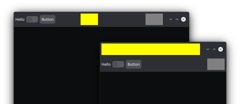
The default header for the Page is set to MauiKit ToolBar, which is divided into three main sections; the left and right side section are the one that can be wrapped into another tool bar when requested - for example, due to space constrains. To know more see the ToolBar documentation.
For it to work just populate the left and right side sections. And then set a constrain check on the split property. When it is set to split: true, the left and right side contents will be moved to a new tool bar under the main header.
- See also
- leftContent
- middleContent
- rightContent
- Warning
- It is important to not change the
headerto a different control. PageLayout depends on MauiKit ToolBar being used.
If it is desired to keep any controls from moving out of the main header, use the farLeftContent and/or farRightContent properties for placing such items, that will insure those items will stay always in place.
You can find a more complete example at this link.
Definition at line 86 of file PageLayout.qml.
Property Documentation
◆ leftContent
|
read |
The toolbar left side content.
This content will be wrapped into a secondary tool bar under the header.
Definition at line 92 of file PageLayout.qml.
◆ middleContent
|
read |
The toolbar middle content.
This elements will not be wrapped and will stay in place.
- Note
- The contents are placed using a RowLayout, so use the layout attached properties accordingly.
Definition at line 103 of file PageLayout.qml.
◆ rightContent
|
read |
The toolbar bar right side content.
This content will be wrapped into a secondary tool bar under the header.
Definition at line 97 of file PageLayout.qml.
◆ split
|
read |
Whether the toolbar content should be wrapped - as in split - into a new secondary toolbar.
By default this is set to false.
- Note
- You can bind this to some space constrain condition.
Definition at line 109 of file PageLayout.qml.
◆ splitIn
|
read |
Where the left and right content will be moved, either to the header or the footer.
The available options are ToolBar.Header or ToolBar.Footer By default it is se to ToolBar.Header
Definition at line 114 of file PageLayout.qml.
The documentation for this class was generated from the following file:
Documentation copyright © 1996-2025 The KDE developers.
Generated on Fri May 2 2025 11:57:11 by doxygen 1.13.2 written by Dimitri van Heesch, © 1997-2006
KDE's Doxygen guidelines are available online.