A page with a header and footer, that can be flipped among many other features.
- Since
- org.mauikit.controls 1.0
This control inherits from QQC2 Pane, to checkout its inherited properties refer to the Qt Docs.
This page has a header and footer bars that by default are set to a MauiKit ToolBar, the header bar can be dynamically moved to the bottom under the footer for better reachability on hand held devices like phones.
- See also
- ToolBar
Any other item can be placed as the header or footer. And the default toolbars can be populated easily via the aliases:
- See also
- headBar
-
footBar
{
id: _page
{
width: parent.width
height: 40
color: "pink"
}
}
A page with a header and footer, that can be flipped among many other features.
Item header
The main single header bar.

A Page with a header and footer - and then the header moved to the bottom under the footer
Features
Among other features, the page can have a reference to a flickable element to allow to have pull-back toolbar behaviour, floating toolbars, etc.
Pull-Back Bars
Pull-back bars allow to expand the contents areas by pulling away the header or footer when content is being flicked/scrolled - which is useful on phone screens. To enable this behaviour you need to reference the Flickable element via the flickable property.
- See also
- flickable
And set the header/footer positioning properties to ListView.PullBackHeader. By default this is set to the header if a flickable element has been assigned, so you can disable it by setting the property to ListView.InlineHeader.
- See also
- footerPositioning
-
headerPositioning
Bars Layout
As mentioned before, the Page has a header and footer area- the header can be moved to the bottom via the alternate header property. But you can also stack multiple bars vertically. So you can have two or more header/footer bars.
- See also
- altHeader
To attach more bars use the header and footer columns property.
- See also
- headerColumn
-
footerColumn
{
id: _page
Rectangle
{
width: parent.width
height: 40
color: "pink"
},
Rectangle
{
width: parent.width
height: 40
color: "yellow"
}
]
}
alias headerColumn
Quick way to add more children to the header bar.
The header/footer layout is handled by a Column control, which can be accessed via the aliases to tweak the spacing for example.
- See also
- headerContainer
-
footerContainer
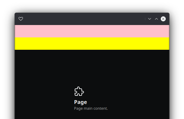
A Page with a default header bar and two rectangles stacked as part of the header column
Floating & AutoHide
The header and/or footer bars can be set to a floating position - which means they will flow over the page contents at the bottom and top. When this is enable a translucency effect will be applied to hint about the content being covered underneath.
- See also
- floatingFooter
-
floatingHeader
The bars can also be set to auto-hide, when the cursor moves out or shown again when the cursor enters the bar area.
- See also
- autoHideFooter
-
autoHideHeader
The time to trigger this actions can be tweaked using the delay properties.
- See also
- autoHideFooterDelay
-
autoHideHeaderDelay
And to finetune the target area which reacts to enter and exit events, use the margins property:
- See also
- autoHideFooterMargins
-
autoHideHeaderMargins

A Page with a floating header - and a translucent effect
Notes
This component is an alternative to the QQC2 Page control, where the header and footer can not be moved easily - and it adds a few more functionality.
The padding properties will affect the header and footer, so if instead you meant to add internal padding to the page contents, you can use the margins properties.
When used in a StackView or SwipeView, this Page emits two signals for the go forward/back actions, which can be consumed to pop or push pages.
- See also
- goBackTriggered
{
id: _page
{
text: "Alt Header"
onToggled: _page.altHeader = checked
}
}
bool altHeader
If set to true the header bar will be positioned to the bottom under the footer bar.
alias headBar
An alias to the default ToolBar as the header bar.

An ApplicationWindow filled with a Page and with the CSD controls enabled
You can find a more complete example at this link.
- Note
- This control supports the attached Controls.showCSD property to display the window control buttons when using CSD. This is only supported if used with the MauiKit ToolBar as the header bar - which is the default. If use with another header element, the window control buttons need to be added manually.
Definition at line 158 of file Page.qml.