ToolBar
Properties | |
| alias | content |
| int | count |
| bool | draggable |
| alias | farLeftContent |
| alias | farLeftLayout |
| alias | farRightContent |
| alias | farRightLayout |
| alias | fits |
| bool | forceCenterMiddleContent |
| alias | layout |
| alias | leftContent |
| alias | leftLayout |
| alias | middleContent |
| alias | middleLayout |
| int | preferredHeight |
| alias | rightContent |
| alias | rightLayout |
| int | visibleCount |
Detailed Description
An alternative to QQC2 ToolBar, with a custom horizontal layout - divided into three main sections - left, middle and right.
This is a good companion to a page header or footer.
This control inherits from QQC2 ToolBar, to checkout its inherited properties refer to the Qt Docs.
The ToolBar sections are divided into five [5] sections, and each one can be easily populated via the alias property. The left and right areas are have two sections, the far-left and far-right, alongside with the left and right.
And lastly there's the middle section - the middle section contents can be centered using the Layout attached properties. When the left and right contents are not equal in size, the middle content can be forced to be centered using the force center property.
- See also
- forceCenterMiddleContent

- Note
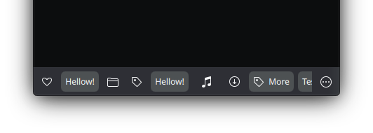
- The ToolBar sections divided by colors. The middle section [green] is filling the available space.
The bar contents will become flickable/scrollable when the child items do not fit in the available space. There will be shadows indicating that there is content to be discovered to the left or right sides.
- See also
- fits
If the application window is using CSD - there is a useful property to allow dragging and moving the window by pressing the toolbar area. This can also be disabled if it is undesired.
- See also
- draggable
Notes
The middle section is handled by a RowLayout, so child items placed in there can be positioned using the Layout attached properties, such as Layout.fillWidth, Layout.alignment, etc.
The other sections will take the size of child items, so any item place into them need to have an implicit size or explicitly set one.
The far left/right sections will not be hidden when the contents of the bar does not fit and becomes scrollable, They will remain in place, so place items in those section which are important to stay always visible, and do not over populate them, instead populate the left and right areas.
- Note
- Here the contents of the bar does not fit, so it becomes hidden and can be scrolled/flicked horizontally.
- Note
- This control supports the attached Controls.showCSD property to display the window control buttons when using CSD.
- Note
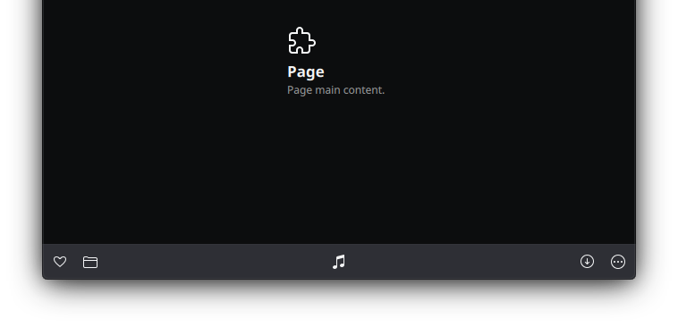
- Using the example as the footer of a page, ToolButtons are placed in the different sections.
Definition at line 115 of file ToolBar.qml.
Property Documentation
◆ content
|
read |
By default any child item of the ToolBar will be positioned at the left section in a row.
So using the leftContent property or just declaring the child items without it will have the same effect.
- See also
- leftContent
- Remarks
- This is the default property
Definition at line 123 of file ToolBar.qml.
◆ count
|
read |
The total amount of items in the toolbar sections, items can be non-visible and sum-up.
- Remarks
- This property is read-only
Definition at line 217 of file ToolBar.qml.
◆ draggable
|
read |
Allow to move the window around by dragging from the toolbar area.
By default this is set to !Maui.Handy.isMobile
Definition at line 227 of file ToolBar.qml.
◆ farLeftContent
|
read |
Alias to add items to the far left section.
Multiple items can be added, separated by a coma and wrapped in brackets [].
Definition at line 166 of file ToolBar.qml.
◆ farLeftLayout
|
read |
The container for the far left section.
- Remarks
- This property is read-only
Some of its properties can be tweaked, such as the spacing and visibility.
Definition at line 201 of file ToolBar.qml.
◆ farRightContent
|
read |
Alias to add items to the far right section.
Multiple items can be added, separated by a coma and wrapped in brackets [].
Definition at line 171 of file ToolBar.qml.
◆ farRightLayout
|
read |
The container for the far right section.
- Remarks
- This property is read-only
Some of its properties can be tweaked, such as the spacing and visibility.
Definition at line 195 of file ToolBar.qml.
◆ fits
|
read |
If the contents width is currently smaller then the available area it means that it fits, otherwise the content is wider then the available area and overflowing and has become scrollable/flickable.
- Remarks
- This property is read-only
Definition at line 212 of file ToolBar.qml.
◆ forceCenterMiddleContent
|
read |
Forces the middle content to be centered by adding extra space at the left and right sections to match the maximum width, so both left/right side have the same width.
Definition at line 131 of file ToolBar.qml.
◆ layout
|
read |
The ColumnLayout that contains all the sections of the toolbar.
- Remarks
- This property is read-only
Definition at line 207 of file ToolBar.qml.
◆ leftContent
|
read |
Alias to add items to the left section.
Multiple items can be added, separated by a coma and wrapped in brackets [].
Definition at line 150 of file ToolBar.qml.
◆ leftLayout
|
read |
The container for the left section.
- Remarks
- This property is read-only
Some of its properties can be tweaked, such as the spacing and visibility.
Definition at line 183 of file ToolBar.qml.
◆ middleContent
|
read |
Alias to add items to the middle section.
Multiple items can be added, separated by a coma and wrapped in brackets []. The container used to host the child items is a ColumnLayout, so child items need to be positioned using the Layout attached properties.
Definition at line 156 of file ToolBar.qml.
◆ middleLayout
|
read |
The container for the middle section.
- Remarks
- This property is read-only
Some of its properties can be tweaked, such as the spacing and visibility.
Definition at line 177 of file ToolBar.qml.
◆ preferredHeight
|
read |
Set the preferred height of the toolbar.
This is the preferred way to set a custom height, instead of setting it up explicitly via the height property. This is used, for example, on the Page control for the pull-back bars feature.
Definition at line 127 of file ToolBar.qml.
◆ rightContent
|
read |
Alias to add items to the right section.
Multiple items can be added, separated by a coma and wrapped in brackets [].
Definition at line 161 of file ToolBar.qml.
◆ rightLayout
|
read |
The container for the right section.
- Remarks
- This property is read-only
Some of its properties can be tweaked, such as the spacing and visibility.
Definition at line 189 of file ToolBar.qml.
◆ visibleCount
|
read |
The total amount of visible items in the tool bar sections.
- Remarks
- This property is read-only
Definition at line 222 of file ToolBar.qml.
The documentation for this class was generated from the following file:
Documentation copyright © 1996-2025 The KDE developers.
Generated on Fri May 2 2025 11:57:11 by doxygen 1.13.2 written by Dimitri van Heesch, © 1997-2006
KDE's Doxygen guidelines are available online.