SectionItem
Properties | |
| bool | childCheckable |
| alias | content |
| bool | flat |
| alias | iconSizeHint |
| alias | iconSource |
| alias | imageSource |
| alias | label1 |
| alias | label2 |
| alias | label3 |
| alias | label4 |
| alias | template |
Detailed Description
An item used for holding information in a vertical column layout.
- Since
- org.mauikit.controls
Although it is similar to the SectionGroup (an information header with the children in a vertical layout) this control has some functionality differences, like being interactive and a different styling of the information labels. It is commonly use as the children elements of the SectionGroup.
- Note
- There is also the FlexSectionItem, which uses a dynamic layout for wrapping the content that does not fit.
- See also
- FlexSectionItem
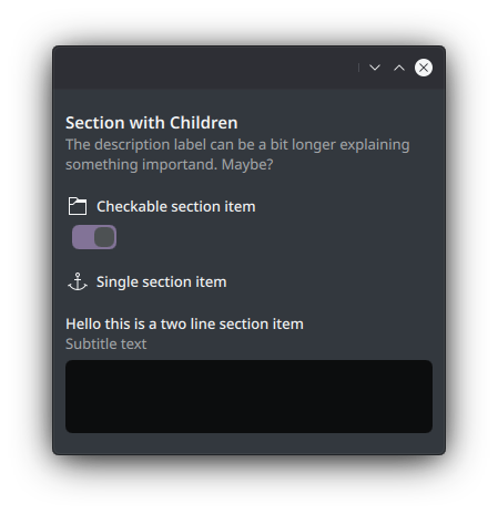
If the first and single child element of this control is checkable, then the state of such control will be toggled by clicking on the area of the SectionItem.
You can find a more complete example at this link.
Definition at line 77 of file SectionItem.qml.
Property Documentation
◆ childCheckable
|
read |
Whether the first children element from the content is checkable.
If it is the the control will have a hover effect to hint about the item being checkable.
- Remarks
- This property is read-only
Definition at line 136 of file SectionItem.qml.
◆ content
|
read |
- Remarks
- This is the default property
Definition at line 90 of file SectionItem.qml.
◆ flat
|
read |
Whether the control should be styled as flat, as in not having a background or hover/pressed visual effect hints.
By default this is set to !Handy.isMobile
- See also
- Handy::isMobile
Definition at line 130 of file SectionItem.qml.
◆ iconSizeHint
|
read |
- See also
- ListItemTemplate::iconSizeHint
Definition at line 124 of file SectionItem.qml.
◆ iconSource
|
read |
- See also
- ListItemTemplate::iconSource
Definition at line 116 of file SectionItem.qml.
◆ imageSource
|
read |
- See also
- ListItemTemplate::imageSource
Definition at line 120 of file SectionItem.qml.
◆ label1
|
read |
- See also
- ListItemTemplate::label1
Definition at line 100 of file SectionItem.qml.
◆ label2
|
read |
- See also
- ListItemTemplate::label2
Definition at line 104 of file SectionItem.qml.
◆ label3
|
read |
- See also
- ListItemTemplate::label3
Definition at line 108 of file SectionItem.qml.
◆ label4
|
read |
- See also
- ListItemTemplate::label4
Definition at line 112 of file SectionItem.qml.
◆ template
|
read |
Definition at line 96 of file SectionItem.qml.
The documentation for this class was generated from the following file:
Documentation copyright © 1996-2025 The KDE developers.
Generated on Fri May 2 2025 11:57:11 by doxygen 1.13.2 written by Dimitri van Heesch, © 1997-2006
KDE's Doxygen guidelines are available online.