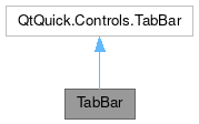
TabBar

Properties | |
| alias | content |
| alias | interactive |
| alias | leftContent |
| alias | rightContent |
| bool | showNewTabButton |
| bool | showTabs |
Signals | |
| void | newTabClicked () |
| void | newTabFocused (int index) |
Public Member Functions | |
| void | itemAt (x, y) |
| void | positionViewAtIndex (index) |
Detailed Description
Tab bar alternative to QQC TabBar, and based on it.
This controls inherits from QQC2 TabBar, to checkout its inherited properties refer to the Qt Docs.
Mostly used together with the TabView control.
The layout of this control is divided into three sections: left, middle and right area. The middle area is reserved for placing the tab buttons. The right and left side areas can be populated with any child item.
All the child items are expected to be a TabButton or inherit from it. If you need to add an extra button, label or other item, consider adding them using the left and right containerizes.
- See also
- leftContent
- rightContent
Notes
The contents of this bar will become flickable/scrollable if the implicit width of the child elements is higher than the available width. When using it on a mobile device and a flick/swipe action is performed by the user, a signal will be emitted informing about the tab focused in the view port.
- See also
- newTabFocused
- Note
- This control supports the attached Controls.showCSD property to display the window control buttons when using CSD.
Definition at line 52 of file TabBar.qml.
Property Documentation
◆ content
|
read |
An alias to manually add elements to the container directly.
This is the middle section of the control.
Definition at line 60 of file TabBar.qml.
◆ interactive
|
read |
Whether the control will react to touch events to flick the tabs.
Definition at line 75 of file TabBar.qml.
◆ leftContent
|
read |
An alias to add elements to the left area section.
Definition at line 65 of file TabBar.qml.
◆ rightContent
|
read |
An alias to add elements to the right area section.
Definition at line 70 of file TabBar.qml.
◆ showNewTabButton
|
read |
Whether to display a button which represents the "add new tab" action.
If this button is clicked a signal is triggered.
- See also
- newTabClicked
Definition at line 81 of file TabBar.qml.
◆ showTabs
|
read |
Whether the tab buttons will be visible or not.
Definition at line 85 of file TabBar.qml.
Member Function Documentation
◆ newTabClicked
|
signal |
This signal is emitted when the "add new tab" button has been clicked.
- See also
- showNewTabButton
◆ newTabFocused
|
signal |
This signal is emitted when a new tab button is focused after a swipe/flick action has been performed.
To set the new focused tab as the current one, use the index value passed as the argument to the currentIndex property. To make sure the tab is fully visible in the view port you can use the positioning function.
- See also
- positionViewAtIndex
◆ positionViewAtIndex()
| void TabBar::positionViewAtIndex | ( | index | ) |
Positions the TabButton at the given index to be centered and visible in the viewport.
The documentation for this class was generated from the following file:
Documentation copyright © 1996-2025 The KDE developers.
Generated on Fri May 2 2025 11:57:11 by doxygen 1.13.2 written by Dimitri van Heesch, © 1997-2006
KDE's Doxygen guidelines are available online.