TabView
Properties | |
| bool | altTabBar |
| alias | content |
| alias | contentModel |
| alias | count |
| alias | currentIndex |
| alias | currentItem |
| alias | holder |
| bool | interactive |
| alias | menu |
| list< Action > | menuActions |
| bool | mobile |
| bool | overviewMode |
| alias | tabBar |
| Component | tabViewButton |
Signals | |
| void | closeTabClicked (int index) |
| void | newTabClicked () |
Public Member Functions | |
| void | addTab (component, properties, quiet=false) |
| void | closeOverview () |
| void | closeTab (index) |
| void | findTab () |
| void | moveTab (from, to) |
| void | openOverview () |
| void | openTabMenu (index) |
| void | setCurrentIndex (index) |
| void | tabAt (index) |
Detailed Description
Container to organize items as a tab view.
This controls inherits from QQC2 Pane, to checkout its inherited properties refer to the Qt Docs.
The TabView organizes its children into different tabs - a tab for each child. There are two ways for adding tabs to this view. The first one and easier is to declare the items as children. This will create a tab for each declared child item.
- See also
- content
The second way to create tabs dynamically by adding new items using the control functions.
- See also
- addTab
Structure
- Note
- If you use this as the application window main control, remember you can use the attached Controls.showCSD property to display the window control buttons.
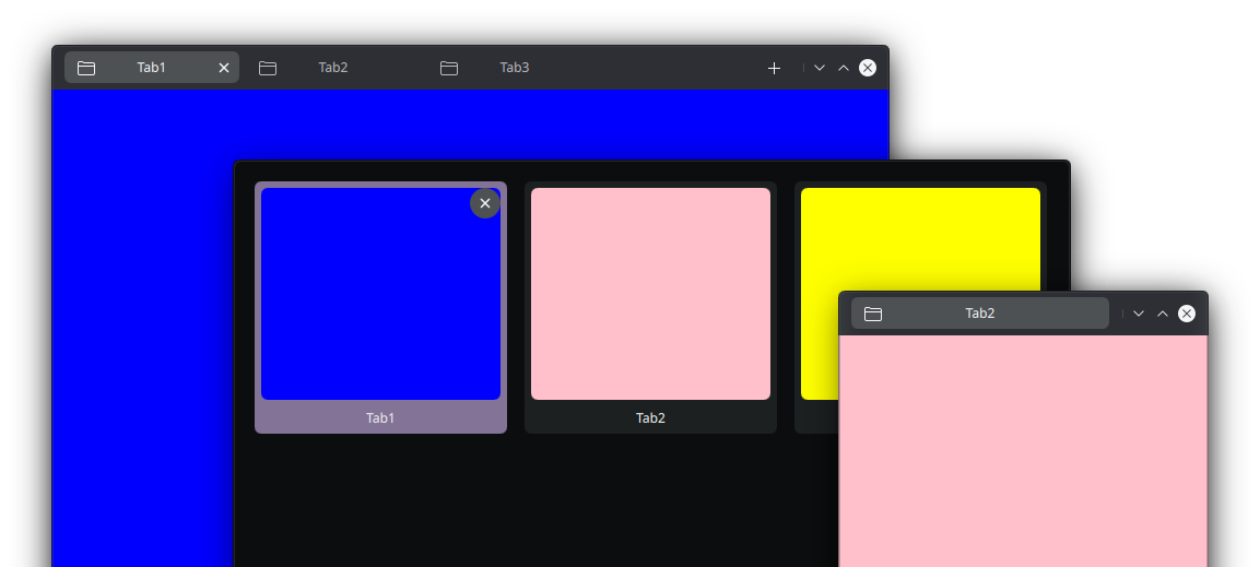
The TabView has two main sections, [1] the main contents area and [2] the tab bar, where the tab buttons - representing all the tab views - are listed.
The tab bar listing has two "modes": one designed to fit desktop computers as a horizontal set of tab buttons; and the other one - more mobile friendly - as a grid overview of miniatures of the tab-views. Both modes can be toggle by using the mobile property.
- See also
- mobile
The main tab bar - usually in the top section - can be moved to the bottom area, for better reachability.
- See also
- altTabBar
The tab bar component is exposed via an alias, and items can be added to it - to the left or right side, using the leftContent or rightContent properties. This tab bar is handled by a MauiKit TabBar.
Finder
The TabView has an integrated dialog to quickly perform searchers for an tab.
Notes
Tabs Info
To add information, such as title, icon, etc, to the views, there is the Controls metadata attached property. Some of the available properties are:
Menus
It is possible to add actions to the the tab contextual menus.
- See also
- menuActions
Customize
It is possible to set a different tab button for the tab bar. This will allow you to have more control about how the tab button is presented. To make it easier to integrate there is a control template that can be use as a base TabViewButton - different from TabButton.
- See also
- tabViewButton
- TabViewButton
- Note
- If you plan to change the tab button, consider using TabViewButton as a base, since it already has many of the needed things by the TabView to be integrated smoothly.
Functionality
By default when clicking/tapping on the current tab button, the overview of tabs miniatures will be opened. The overview can also be oped using the corresponding function.
- See also
- openOverview
- closeOverview
You can find a more complete example at this link.
Definition at line 122 of file TabView.qml.
Property Documentation
◆ altTabBar
|
read |
Whether the tab bar hosting the tab buttons, should go in the bottom section or not.
Moving it to the bottom section is a good idea for reachability in hand-held devices, such a phones. You can check if the current platform is a mobile one using the Handy attached property Handy.isMobile
- See also
- Handy
Definition at line 169 of file TabView.qml.
◆ content
|
read |
Each one of the items declared as the children of this component will become a tab view.
- Remarks
- This is the default property
Definition at line 129 of file TabView.qml.
◆ contentModel
|
read |
An alias to the model of the container.
- Remarks
- This property is read-only
Definition at line 135 of file TabView.qml.
◆ count
|
read |
The total amount of views in this container.
- Remarks
- This property is read-only
Definition at line 152 of file TabView.qml.
◆ currentIndex
|
read |
Current index number of the current tab in the view port.
Definition at line 140 of file TabView.qml.
◆ currentItem
|
read |
The current item/tab view in focus.
- Remarks
- This property is read-only
Definition at line 146 of file TabView.qml.
◆ holder
|
read |
An alias to a place holder text handled by a MauiKit Holder control.
This is useful to display messages when there is not tab views in this container. To see how to set the message, icon and actions to it checkout the Holder documentation.
- See also
- holder
Definition at line 158 of file TabView.qml.
◆ interactive
|
read |
Whether the view will support swipe gestures for switching between tab views.
Definition at line 173 of file TabView.qml.
◆ menu
|
read |
An alias to the contextual menu for the tab buttons.
This has a child property named index, which refers to the index number of the tab for which the contextual menu was opened.
- See also
- ContextualMenu
Definition at line 190 of file TabView.qml.
◆ menuActions
|
read |
A set of actions can be added to the tab button contextual menu.
Definition at line 208 of file TabView.qml.
◆ mobile
|
read |
Whether the layout of the tab bar should be in mobile or desktop mode.
In mobile mode there is only one tab button in the tab bar view port, other tab button can be navigated by using the touch swipe gesture. In mobile mode the main method to switch between tab views is using the overview.
- See also
- structure
Definition at line 163 of file TabView.qml.
◆ overviewMode
|
read |
Checks if the overview mode is open.
- Remarks
- This property is read-only
Definition at line 178 of file TabView.qml.
◆ tabBar
|
read |
An alias to the tab bar element.
This is exposed so any other items can be placed on the right or left sections of it, or to fine tweak its public properties.
- See also
- TabBar
Definition at line 184 of file TabView.qml.
◆ tabViewButton
|
read |
The component to be used as the tab button in the tab bar.
This can be changed to any other item, but it is recommend it to use TabViewButton as the base of the new custom control for the better integration.
- See also
- TabViewButton
Definition at line 213 of file TabView.qml.
Member Function Documentation
◆ addTab()
| void TabView::addTab | ( | component | , |
| properties | , | ||
| quiet | = false ) |
Adds a new tab view element, the passed element must be a component which will be created by the function and then added to the container.
- Parameters
-
component a Component element hosting the actual element to be created. properties set of values that can be passed as a map of properties to be assigned to the component when created quiet optionally you can choose to create the tab quietly or not: by quietly it means that the tab-component will be instantiated and created but will not be focused right away. If quiet is set to false- to which it defaults to - then after the creation of the component the new tab will get focused.
◆ closeOverview()
| void TabView::closeOverview | ( | ) |
Close the overview of miniature tabs.
◆ closeTab()
| void TabView::closeTab | ( | index | ) |
Close a tab view at a given index.
This will release the resources, and move the focus to the previous tab view
- Parameters
-
index index of the tab to be closed
◆ closeTabClicked
|
signal |
Emitted when the close button has been clicked on a tab button, or tab miniature in the overview.
This signal sends the index of the tab. To correctly close the tab and release the resources, use the function closeTab().
- Parameters
-
The index of the tab requested to be closed.
- See also
- closeTab
◆ findTab()
| void TabView::findTab | ( | ) |
Method to open the tab finder.
◆ moveTab()
| void TabView::moveTab | ( | from | , |
| to | ) |
Method to correctly move a tab from one place to another by using the index numbers.
- Parameters
-
from the current index number of the tab to be moved to the new index value to where to move the tab
◆ newTabClicked
|
signal |
◆ openOverview()
| void TabView::openOverview | ( | ) |
Method to open the tabs overview.
◆ openTabMenu()
| void TabView::openTabMenu | ( | index | ) |
Opens the tab contextual menu at a given index number.
◆ setCurrentIndex()
| void TabView::setCurrentIndex | ( | index | ) |
This allows to change the current tab without breaking the bindings from the currentIndex property.
- Parameters
-
index the index to change to
◆ tabAt()
| void TabView::tabAt | ( | index | ) |
The documentation for this class was generated from the following file:
Documentation copyright © 1996-2025 The KDE developers.
Generated on Fri May 2 2025 11:57:11 by doxygen 1.13.2 written by Dimitri van Heesch, © 1997-2006
KDE's Doxygen guidelines are available online.