SelectionBar
Properties | |
| list< Action > | actions |
| alias | count |
| int | display |
| bool | hidden |
| list< Action > | hiddenActions |
| alias | items |
| Component | listDelegate |
| int | maxListHeight |
| int | radius |
| bool | singleSelection |
| alias | uris |
Signals | |
| void | cleared () |
| void | clicked (var mouse) |
| void | exitClicked () |
| void | itemAdded (var item) |
| void | itemClicked (int index) |
| void | itemPressAndHold (int index) |
| void | itemRemoved (var item) |
| void | rightClicked (var mouse) |
| void | uriAdded (string uri) |
| void | uriRemoved (string uri) |
| void | urisDropped (var uris) |
Public Member Functions | |
| void | append (uri, item) |
| void | clear () |
| void | close () |
| void | contains (uri) |
| void | getSelectedUrisString () |
| void | indexOf (uri) |
| void | itemAt (index) |
| void | open () |
| void | removeAtIndex (index) |
| void | removeAtUri (uri) |
 Public Member Functions inherited from QtQuick.Item Public Member Functions inherited from QtQuick.Item | |
| childAt (real x, real y) | |
| bool | contains (point point) |
| dumpItemTree () | |
| forceActiveFocus () | |
| forceActiveFocus (Qt::FocusReason reason) | |
| bool | grabToImage (callback, targetSize) |
| point | mapFromGlobal (real x, real y) |
| point | mapFromItem (Item item, point p) |
| point | mapFromItem (Item item, real x, real y) |
| rect | mapFromItem (Item item, real x, real y, real width, real height) |
| rect | mapFromItem (Item item, rect r) |
| point | mapToGlobal (real x, real y) |
| point | mapToItem (Item item, point p) |
| point | mapToItem (Item item, real x, real y) |
| rect | mapToItem (Item item, real x, real y, real width, real height) |
| rect | mapToItem (Item item, rect r) |
| nextItemInFocusChain (bool forward) | |
Detailed Description
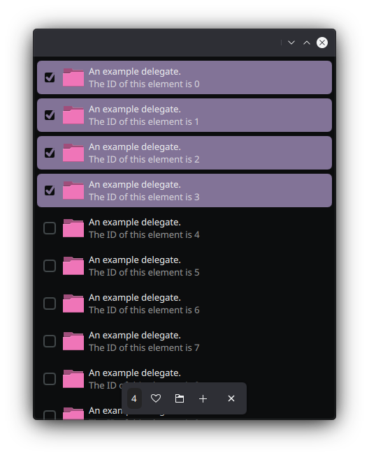
A bar to group selected items and a list of actions to perform to such selection.
This controls inherits from QQC2 Item, to checkout its inherited properties refer to the Qt Docs.
The list of actions is represented by a set of buttons in a horizontal row layout.
- See also
- actions
This control provides methods to append and query elements added to it. To add elements, it is necesary to map them, so each item has an unique ID referred here as an URI.
- See also
- append
Notes
By default it is hidden when the selection is empty.
- See also
- count
The SelectionBar is usually placed as the footer element of a Page. This control is styled as a floating bar, so it can be placed on top of its parent contents; due to this behavior it is a good idea to pair it with a MauiKit Page as its footer, and set the Page property floatingFooter: true.
Most of the times this will be uses along with a browsing view, such as a ListBrowser or GridBrowser, which will list the items to be added or removed from the selection.
Here we have three components that can be intertwined: Page, ListBrowser and the SelectionBar. For the floating selection bar to not get on the way of the contents, the Page property flickable needs to be set to the flickable element of the browsing view, such as the ListBrowser::flickable.
Below you will find a more complete example of the functionality of these three controls out together.
You can find a more complete example at this link.
Definition at line 169 of file SelectionBar.qml.
Property Documentation
◆ actions
|
read |
Default list of QQC2 Action; the actions are represented as buttons.
All of the actions listed in here will be visible, to hide some use the hiddenActions property.
- See also
- hiddenActions
- Remarks
- This is the default property
Definition at line 193 of file SelectionBar.qml.
◆ count
|
read |
Total amount of items selected.
- Remarks
- This property is read-only
Definition at line 238 of file SelectionBar.qml.
◆ display
|
read |
The preferred display mode for the visible action buttons.
By default this is set to ToolButton.TextBesideIcon.
Definition at line 202 of file SelectionBar.qml.
◆ hidden
|
read |
Whether the bar is currently hidden.
This is not the same as visible. It is hidden when there is not items in the selection.
- Remarks
- This property is read-only
Definition at line 180 of file SelectionBar.qml.
◆ hiddenActions
|
read |
List of action that won't be shown inside of the bar, but instead will always be hidden and listed in a dedicated overflow menu button.
Definition at line 197 of file SelectionBar.qml.
◆ items
|
read |
The array list of the items selected.
- Remarks
- This property is read-only
Definition at line 232 of file SelectionBar.qml.
◆ listDelegate
|
read |
Delegate to be used in popup list.
By default this is set to use a MauiKit ListBrowserDelegate. The model use to feed the popup list is a QQC2 ListModel, populated by the item passed as the argument to the append method.
- See also
- append
Definition at line 245 of file SelectionBar.qml.
◆ maxListHeight
|
read |
The list of items can be displayed in a popup.
This property defines the maximum height the popup list. By default this is set to 400.
Definition at line 207 of file SelectionBar.qml.
◆ radius
|
read |
By default the selection bar was designed to be floating and thus has rounded border corners.
This property allows to change the border radius. By default this is set to Style.radiusV.
Definition at line 213 of file SelectionBar.qml.
◆ singleSelection
|
read |
Whether the control only accepts a single item.
If single selection is set to true then only a single item can be appended, if another item is added then it replaces the previous one. By default this is set to false.
Definition at line 219 of file SelectionBar.qml.
◆ uris
|
read |
The array list of the URIs associated to the selected items.
- Remarks
- This property is read-only
- See also
- items
Definition at line 226 of file SelectionBar.qml.
Member Function Documentation
◆ append()
| void SelectionBar::append | ( | uri | , |
| item | ) |
Appends a new item to the selection associated to the given URI.
- Parameters
-
uri the URI to be associated with the item item a map to be used to represent the item in the model. For example a valid item map would be: ‘({'title’: "A title", 'icon': "love"})`
◆ clear()
| void SelectionBar::clear | ( | ) |
◆ cleared
|
signal |
Emitted when the selection is cleared either by the constrain of the single selection or by manually calling the clear method.
◆ clicked
|
signal |
Emitted when an empty area of the selection bar has been clicked.
- Parameters
-
mouse the object with information of the event
◆ close()
| void SelectionBar::close | ( | ) |
Forces to close the selection bar, if visible.
◆ contains()
| void SelectionBar::contains | ( | uri | ) |
Returns whether the selection contains an item associated to the given URI.
- Parameters
-
uri the URI used to append the item
◆ exitClicked
|
signal |
Emitted when close button is pressed or the Escape keyboard shortcut invoked.
◆ getSelectedUrisString()
| void SelectionBar::getSelectedUrisString | ( | ) |
Returns a single string with all the URIs separated by a comma.
◆ indexOf()
| void SelectionBar::indexOf | ( | uri | ) |
Returns the index of an item in the selection given its URI.
- Parameters
-
uri the URI used to append the item
- Returns
- the index number of the found item, otherwise
-1
◆ itemAdded
|
signal |
Emitted when an item is newly added to the selection.
- Parameters
-
item the item map passed to the appendfunction.
◆ itemAt()
| void SelectionBar::itemAt | ( | index | ) |
Returns an item at the given index.
- Parameters
-
index the index number of the item.
- Note
- Note that this is the index of the internal list on how items were added, and not the original index of the source list used to make the selection.
- Returns
- the requested item/map if it is found, otherwise null.
◆ itemClicked
|
signal |
Emitted when an item in the popup list view is clicked.
@paran index the index number of the item clicked. Use the itemAt function to get to the item.
- See also
- itemAt
◆ itemPressAndHold
|
signal |
Emitted when an item in the popup list view is pressed for a long time.
@paran index the index number of the item clicked. Use the itemAt function to get to the item.
- See also
- itemAt
◆ itemRemoved
|
signal |
Emitted when an item has been removed from the selection.
- Parameters
-
item the item map passed to the appendfunction.
◆ open()
| void SelectionBar::open | ( | ) |
Forces to open the selection bar, if hidden.
◆ removeAtIndex()
| void SelectionBar::removeAtIndex | ( | index | ) |
Remove a single item at the given index.
- Parameters
-
index index of the item in the selection list
◆ removeAtUri()
| void SelectionBar::removeAtUri | ( | uri | ) |
Removes an item from the selection at the given URI.
- Parameters
-
uri the URI used to append the item
◆ rightClicked
|
signal |
Emitted when an empty area of the selection bar has been right clicked.
- Parameters
-
mouse the object with information of the event
◆ uriAdded
|
signal |
Emitted when an item is newly added to the selection.
This signal only sends the URI of the item.
- Parameters
-
uri the URI identifier
◆ uriRemoved
|
signal |
Emitted when an item has been removed from the selection.
This signal only sends the URI of the item.
- Parameters
-
uri the URI identifier
◆ urisDropped
|
signal |
Emitted when a group of URLs has been dropped onto the selection bar area.
- Parameters
-
uris the list of urls
The documentation for this class was generated from the following file:
Documentation copyright © 1996-2025 The KDE developers.
Generated on Fri May 2 2025 11:57:11 by doxygen 1.13.2 written by Dimitri van Heesch, © 1997-2006
KDE's Doxygen guidelines are available online.